
Last month I attended a conference where I had a couple of interesting conversations on the topic of participant loans. Financial wellness was a big theme at the conference. The advisers I spoke with were all trying to use participant loans as a window into the financial health of 401(k) plan participants. More specifically, they were interested in the ratio of outstanding participant loans to total plan assets. The idea being, the higher the ratio, the more likely participants are in need of a financial wellness program.
Thinking about this on my way home, I wondered what even constitutes a high participant loan to total assets ratio? And how much variation is there in this ratio? One of the great benefits of working at Judy Diamond is having access to the historical 5500 data in its raw form. The data can then be imported into tools like Tableau or Panda Dataframes to do more detailed analysis. So once back home, I got to work exploring this aspect of the data.
The Data
To begin the analysis, I gathered all the 401(k) plans available from our raw data feed where both End of Year Total Assets and End of Year Participant Loans were greater than zero. This yielded about 1.7 million records over 8 years from 2010 to 2017. Each year contains approximately 220,000 records with 2017 a partial year containing 129,000 records.
Looking at the full data set, the median % of Participant Loans to Total Plan Assets (PL/TPA) is equal to 2.10% but the average is a whopping 22.64%! We should take this figure with a gain of salt since, as we will see, this data set has a long tail with some major outliers skewing our distribution.
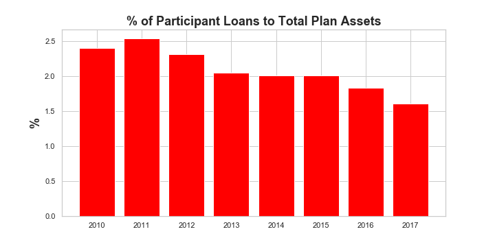
Let’s first break it down by year.
From the historical bar chart, we see that the median PL/TPA ratio has actually been declining from a high of 2.5% in 2011 to a low of 1.6% in 2017 (albeit these are partial year numbers for 2107, but should be reflective of the full year).
What can we glean from this? Well there is certainly a trend here that could indicate that 401(k) plan participants are borrowing less against their retirement plans. This would be good news and perhaps a reversion back to a what rates were prior to the Great Recession. This could be an explanation for the higher rates in 2010 and 2011. The other explanation may be less in the numerator of this ratio but rather the denominator.
Bull Market in Equities
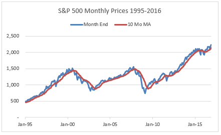
It’s curious that the start of our downward trend in the PL/TPA ratio corresponds closely to the start of the equity bull market in 2009. Without further analysis, it’s hard to say which is the correct interpretation. My guess is that it is a combination of the two. It stands to reason that, as the economy improved, plan participants were able to repay the loans taken in the immediate aftermath of the Great Recession reducing outstanding loan amounts. At the same time plan assets would have been boosted by higher equity returns.
A Long Tail Wagging the Dog?
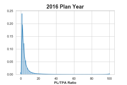
The last point I want to make about this data is how skewed the distribution is. As mentioned above, the difference between the median PL/TPA ratio to the average is huge. In fact, there are plans that have 100% PL/TPA ratios. How this happens will require more analysis and perhaps should be excluded altogether from the analysis. But to give you an idea of what this looks like, here is the distribution for 2016, the most recent full year of data in our analysis.
Now let’s look all the years in our analysis excluding the values in our tail by limiting the PL/TPA ratios to those between 0 and 5% which will capture the bulk of our plans.
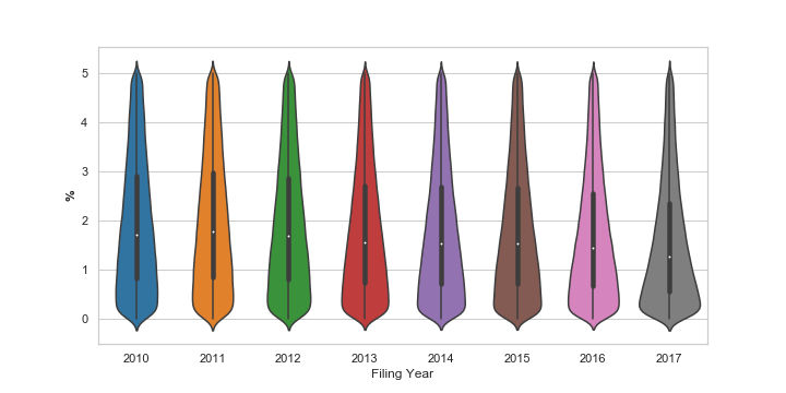
We can see the downward trend in the median PL/TPA ratio represented by the white dot. But it also appears that the distribution has gotten tighter around the median with 2017 showing the most pronounced tightening. The black box illustrates the extent of the 25th and 75th percentiles.
So What’s the Right Number?
If you are inclined to believe that the ratio of 401(k) plan participant loans to total plan assets is an indicator of participant financial wellness, you would be best to focus your efforts on plans where this measure exceeds 2%. But recognize that there are a lot of outliers and financial wellness may not have anything at all to do with this statistic.
Perhaps a look at individual states or looking at micro versus mega plans will yield additional insights. Stay tuned.