Back Office Support in the Retirement Space: Marketing and Graphic Creation
October 29, 2019

Here at Judy Diamond, we often find our retail level clients face unique challenges. Frequently these users are the members of small teams, if not the only person at their office responsible for bringing in new business to their firm. Perhaps they are members of a larger firm with dedicated support teams, but others are vying for the resource. Many clients are new to the business. They come to us looking to learn how to sell in this space as quickly as they can.

In the end, each of these groups come to us because they need some “back office support” to meet their sales goals in the most efficient and straightforward path possible. 

What is this “Back Office Support”?

A big challenge for these clients is how to do all the activities required to bring in new business while maintaining their current book of business. Tasks such as:

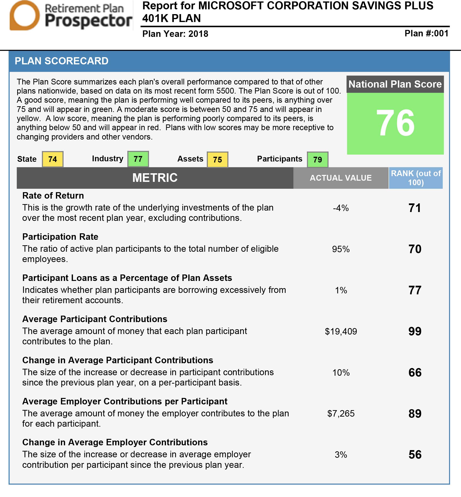
  • Benchmarking analysis
  • Determining what plans in a market are weaker than others and explaining these weaknesses to plan holders
  • Writing marketing letters for direct or email campaigns
  • Creation of presentation-ready reports and graphics
  • Dig up information on businesses current plans

I like to call these tasks “Back Office Support”. These are support tasks often provided by knowledgeable staff focused on helping you win over your client. Larger firms often have dedicated departments of experts devoted to these support tasks. However, at smaller firms, these support roles are usually rolled up into the hands of the same person responsible for bringing in the new business. 

With so many tasks falling onto one person, organization and efficiency become even more critical.

Judy Diamond listened to the needs of these clients. We spent two years building Retirement Plan Prospector Plus (RPP+) to do just that: Act as your marketing, graphics, and research departments so that you can walk into your next meeting with everything you need to move along your sales cycle. 

In this series of posts, we will look at how to take advantage of the edge RPP+ gives you. Let’s first look at how RPP+ can support your marketing and graphic design needs.

Marketing Letters

After you know who you want to reach out to, your next step is to decide on messaging. What do you want to say to these leads? How can you get your value proposition across effectively?  When starting a new business campaign, larger firms may bring in assistance from their marketing department. The marketing team often provides two essential tasks to help the salesperson. 

  • Make sure the copy, or text, conveys the message the salesperson wishes to send out using the best tone and voice possible. 
  • Layout the text in an attractive and easy to read format

While having a whole team of marketers helping craft your messaging is the best way to go, RPP+ can help those whose firm does not have a dedicated marketing team. It can also act as a stand-in for those firms whose marketing teams are unavailable.  

Those who do not have access to a dedicated marketing department can turn to the RPP+ module for support. This add-on module grants users access to professionally written marketing ready for you to use! These letters are not only crafted by our knowledgable team, they are also tied into our powerful RPP+ data. This means the letters pull in plan details specific to the business you are reaching out to. They are also easily downloaded so that you can make any adjustments to the letter (if you wish). 

In no time at all, you have copy ready to be included in your next email or direct mail campaign!

Presentation-ready Reports and Graphics

Often when you are putting together your materials for a meeting with a potential client, it’s a good idea to include graphics. Graphics are a great way to take complex material and make it more easily understandable. Additionally, graphics help pull in clients who are more visual learners. 

However, not everyone has the time or inclination to learn how to create graphics packages of their own. If you work for a large firm, the marketing department might be able to build some charts or format a few graphs for you…if they have time. But even then, you have to worry about collecting the data you need, give it to the graphics expert, explain to them what the data means and how you would want it shown. This would likely take several emails back and forth, plus the additional call or two, to sort it out. 

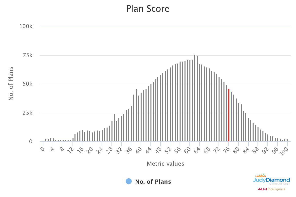
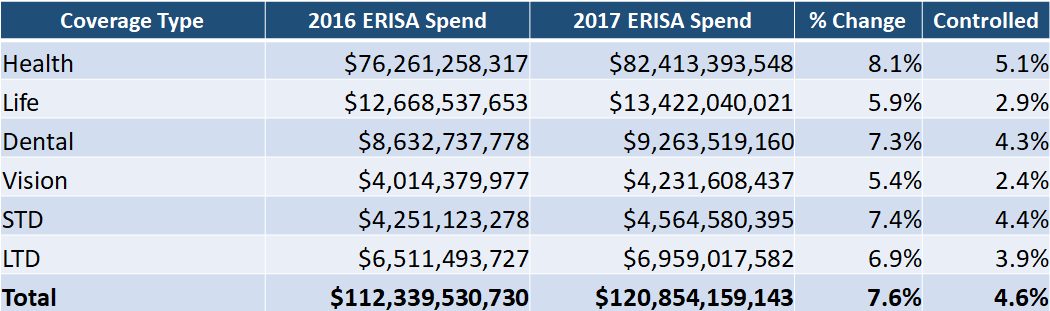
Our RPP+ module reduces the need for all this hassle by providing attractive and easy to understand charts and graphs ready for our clients to use. If you were want to show your client how Microsoft compares to other software publishers, you can! By accessing RPP+’s Benchmarking tools, you can quickly build a peer group containing software publishers. Then, which a couple 

of clicks, you can generate a graph comparing Microsoft’s Plan Score against over 2,000 other companies in the same market. 

No worrying about collecting data, now worrying about if the graph correctly represents the data. In under a minute, you have a graphic ready for you to drop into your report.

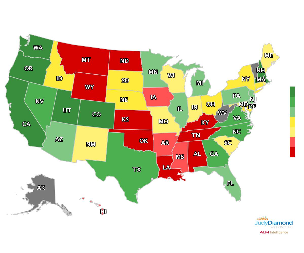
Let’s say you need a heat map showing what states or counties have Software Publishers. Once again, in a few seconds, you can have a graphic pulling on that same data pool of over 2,000 different sponsors. 

But RPP+ goes even further. Not only are we able to provide these single graphics for you, but we also provide each RPP+ client with our presentation-ready plan reports. These adjustable reports pull all the data that you receive with your RPP+ account into a multipage PDF. You get to select what information you want to include in the report. You get to choose

What about Research?

But we all know that preparing for a sale is more than just squaring away your marketing and graphics. You need to know all you can about your lead. Not only that, you need to know how your lead compares to the client you prefer to work with. Moreso, which of the nearly 800,000 plans that are filed every year provide the best ROI of your valuable time?

In my next blog, we will go into how RPP+ can act as your back office Research team providing you with the data you need.

Posted in: Blog
 | Tags: , , ,
Back-to-school: 403(b) Plans
September 16, 2019

At the time of this writing, it is mid-September. The air is beginning to chill, the leaves are starting to turn, but most importantly your kids are now back in school. This makes it the ideal time to talk about 403(b) plans, the savings vehicle most commonly used by teachers (and others in the not-for-profit space) to save for retirement.

If you understand 401(k) plans, you mostly understand 403(b) plans as well. 403(b)s are Defined Contribution plans where the participant’s money is tucked away for tax-deferred growth. Traditional Defined Benefit pension plans for teachers are critically underfunded, and many states have been forced to cut benefits for future retirees. Depending on a DB as a primary source of retirement income can have devastating consequences (just ask the auto workers), which brings us back to 403(b) plans.

According to the Bureau of Labor Statistics, there are approximately 20 million eligible 403(b) participants (both educators and non-profit employees) across the country, which suggests that there are probably about 200,000 403(b) plans. We don’t know what the actual number is, because of one of the most significant differences between 403(b) plans and their 401(k) cousins: ERISA status.

ERISA, the Employee Retirement Income Security Act, provides participants and plan sponsors with certain basic protections and safeguards. The problem is that not all 403(b) plans are ERISA-qualified. In fact, most of them are not. Let’s examine what makes a 403(b) plan ERISA qualified and what that means.

The “default” setting on a 403(b) plan tends to be that it is not ERISA qualified. To qualify for an exemption from ERISA, a 403(b) has to meet certain criteria. There are a lot of them, but it mostly boils down to 3 things:


  1. Participation in the plan is completely voluntary
  2. The only form of plan contribution allowed is the employee deferrals. In other words… NO EMPLOYER MATCH.
  3. The employer doesn’t become too involved in plan administration


The first item on this list is pretty self-explanatory; you can’t force people into the plan or mandate participation. Items 2 and 3 are actually variations on the same theme, though I broke them out here as separate items because I’ve seen #2 trip up a lot of employers. Essentially, in order to maintain an ERISA-exempt 403(b) plan the sponsor has to stay as far away from the plan as possible. The role of the sponsor in this situation is to set up the plan, hire a good TPA to manage said plan, and run for the hills. The more involvement a sponsor has in the 403(b), the more likely it will be that the 403(b) loses its ERISA exemption.

Running an ERISA-qualified 403(b) plan is not a bad thing, necessarily. The upside is that ERISA-qualified plans are generally exempt from state laws because they’re governed by federal ones. This, of course, is super useful if you are a non-profit with employees in multiple states. Sponsors of ERISA-qualified plans can be as involved as they want, making decisions on plan design, dropping in employer matches, and generally ensuring the plan stays in compliance. Both sponsors and participants are also protected by the weight of ERISA. For Sponsors, this means that they are protected from liability for losses arising from the investment decisions of the participants (as long as they meet ERISA 404(c) requirements). For participants, it ensures transparency into fees and other aspects of plan administration, courtesy of the Form 5500 ERISA disclosure document. The downside for a plan sponsor is that now they’ve actually got to file a 5500 and comply with all aspects of ERISA.

Speaking of 5500s, just how many 403(b) plans out there are actually filing? Here’s a look at the number of ERISA-qualified 403(b) plans over the last six years.

You can see from the chart that the number of ERISA-qualified 403(b) plans is declining (though in the interest of full disclosure, the 2018 number is an estimate based on the ~40% of 2018 filings currently available). By my estimate, this means that of all the 403(b) plans out there only about 10% are ERISA-qualified.

There are a number of possible, even probable reasons for this decline. In 2012, the Department of Labor clarified its position on whether or not an employer match is enough to subject a plan to ERISA (yes, it is). This caused some sponsors to unexpectedly find themselves with an ERISA plan they didn’t want, and some have been remodeling their plans to regain an ERISA exemption. Additionally, the introduction of the fiduciary rule has given rise to more TPAs who offer a full, turnkey solution, which is exactly what a 403(b) sponsor needs if they want to be exempt.

So as you are attending “meet the teacher” and “back to school” sessions, make sure you ask your children’s educators about their 403(b) plan. Unless, of course, you work for the school district, in which case you may be inadvertently waiving your ERISA exemption.

Posted in: Blog
 | Tags: , , ,
7 Data Points You Need to Use When Prospecting the Group Insurance Market – A Primer
April 15, 2019

My favorite part of the Form 5500 is the Schedule A. Here’s where we find the meat of health and welfare plans, the insurance contract disclosure and any brokers that sold the policy. Retirement plans will fill out this Schedule as well if they have an annuity contract. But for the purpose of this article, we’ll focus entirely on how to interpret a Schedule A on welfare plans. This article is an introduction, and you can check out its follow-up for building more nuanced searches.

Given how integral it is to either developing broker relationships or assessing competition, there’s a brevity of fields on the Schedule A. Never fear! Judy Diamond Associates has spent years supplementing the data and making connections so that you can work more efficiently and effectively. Below is a list of the most commonly requested data points.

Carrier Name

This is the carrier who is assuming the risk for the benefits selected on the Schedule A. You’ll only see one carrier per Schedule A. Fun fact, sometimes a sponsor name will show up in this field. I take this to mean they’re self-insuring the benefits.

Renewal Date

This usually is identical to the plan year beginning and end date. However, I like to point it out because sometimes you see a policy that ends mid-plan year abruptly. Always worth investigating!

Carrier Benefit Codes

This list of health and welfare benefits was determined by the DOL and has only 13 codes that run through the letters A – M. This is isn’t to be confused with the Form 5500s main page’s Plan Types descriptions (Section II, Field 8a) where a sponsor identifies what they’re offering to their participants. These codes are only for the policy in question and may provide a bit more detail than the Play Types. For example, in addition to the option to select Health a carrier could use HMO or select Health and PPO as a qualifier.

You might have noticed that JDA has 26 codes in their tools. That’s thanks to the next item, “Other” text entries.

The “Other” Text

When a carrier marks code M for “Other” they need to fill out a brief description of what that “Other” benefit includes. That text is searchable in The American Directory of Group Insurance, but we realized early on that it was going to be like hunting for a bent needle in a haystack. That’s because there are no guidelines on how to report benefits. So we created a process to identify the most frequently filed write-ins and created an additional 13 categories just for them. That way you’re not struggling to figure out if Accidental Death & Dismemberment was disclosed as AD&D, AccD&D, Accidental Death & portDismemeberment (that typo is intentional in this article but probably not on the policy), or any other variation you can imagine!

Lives Covered

The number of individuals covered by the policy. Caution, there’s potential for confusion here. The DOL’s instructions indicate on the Form 5500 that participants should be either current or former employees or members of the sponsor. The Schedule A’s instructions say to disclose who is covered by the policy. Some carriers interpret this as spouses, dependents, and participants because their lives covered count exceeds the Total Participants field.

Broker Name

In the fourteen years Managing Director Eric Ryles has been with Judy Diamond Associates, he’s never had a good night’s sleep. Why? Because the DOL has some fuzzy disclosure requirements on brokers. And it’s all thanks to this simple sentence:

What we see on 5500s is that there’s a broad interpretation of how to report that information. Maybe they list the individual but not the firm. Or perhaps it’s the firm, and no individual is registered (particularly common with the larger brokerages). But rarely do filers provide both an agent and the firm they work for.

Fortunately for you, Eric’s restlessness has become JDA’s restlessness. Our dedicated team identifies connections between a broker and a firm and cleaning up data, so your prospect lists and market reports are representative of your search. That’s the core of our BCMS database.

Premiums

This is the value of the contract for the benefits and lives covered. It’s a single-line field with no ability to clarify if the premiums were voluntary or determine how much each benefit on a multi-line policy earned. And yes, you guessed correctly, JDA has identified workarounds to that! Voluntary benefits are typically found on policies with write-in text, and as I mentioned above, that’s searchable. As for multi-line policies, we introduced our Modeled Premiums in late 2018 and continue to build out that model in both Group Insurance and BCMS.

Posted in: Blog
 | Tags: , , ,
Cracking the Modeled Premium Code
April 08, 2019

I’ve been working with 5500 data for the last 16 years. In that time I have come to appreciate both its value as well as its limitations. One of those limitations has always been how to handle multi-line insurance policies. This is one of those things that is perhaps better explained with a visual. Below is a typical insurance policy found on a 5500.

Data Collection Methodology

These insurance policies (commonly known as “Schedule A’s”) are created, filled out by the insurance company, and sent over to the plan sponsor to be filed along with their 5500. The insurance company checks off the boxes, as we see above, to indicate what kind of insurance coverages are offered as a part of this policy. So far so good, right? A problem arises in that although there can be many different coverages, there is only a single dollar figure to represent the premiums collected by the insurance company.

Why is this an issue? Looking across multiple policies to figure out how much an insurance carrier is collecting for a specific type of coverage is impossible. How much dental coverage does MetLife write? We don’t know and we can’t know. It is too often mixed in with life coverage. The situation gets even worse for big carriers like Aetna and Cigna who offer health insurance as well as life, dental, etc…

Breaking the Data Apart

After years of grappling with the issue, we finally found a solution. With the help of some friendly insurance carriers who prefer to remain nameless, we developed a model that allows us to break apart these multi-line policies. We call these “modeled premiums.” Our testing shows these models are accurate to within 10% of what the carrier themselves recognizes in premiums. We’ve successfully modeled premiums for Health, Life, Dental, Vision, STD, and LTD coverages.

Modeled premiums have been live in our Group Insurance tool for nearly a year. Because of their popularity, at the beginning of Q2, 2019 we put them into our Brokers and Carriers Market Share database. Having the ability to recombine modeled premiums by the broker, across every 5500 on which that broker appears, gives us an entirely new way to assess the market share of brokers. Want to know who sold the most dental in California? Which carrier sold more dollars of group life coverage east of the Mississippi? Now, finally, we can tell you.

Because this has been my project for the last few years, I took the first whack at producing some original research on the subject. It includes a state-by-state and industry-by-industry breakdown of the change in overall ERISA-spend year over year, modeled out by each of our six lines of coverage. Here’s a sneak peek at one of the tables:


To download the complete report, for free, simply click here: https://www.judydiamond.com/slide-deck-state-of-the-industry/. For more information, contact us at 800-231-0669

Posted in: Blog
 | Tags: , ,
Searching by Plan Type vs Searching by Carrier Benefits All
March 04, 2019

If you’re a user of our American Directory of Group Insurance tool, you might be familiar with the Plan Type search, which allows you to search by the plan type codes listed on the Form 5500 (and if you’re not a user of the American Directory of Group Insurance, sign up for a free trial here). While this search is useful for finding basic plan types like Health, Dental, Vision, and etc., there are a number of plan types that aren’t included in this search filter that you might be missing out on. That’s where Carrier Benefits All comes in. We’re going to explore this underused search filter to show you where the data comes from and what the differences are, so that you can use this in your own group insurance lead generation.

Where The Data Comes From

The data that we use for the Plan Types search comes from section 8b on the main Form 5500. This section gives an overview of the basic plan types covered by the entire plan.


Sample Section 8b of the 5500

The data we use for the Carrier Benefits All search filter comes from the Schedule A itself, section 8 in Part III to be exact. This section has a much more expansive list of benefit types, and shows exactly what each policy covers.


Sample Section 8 of the Schedule A

Since Section 8 on the Schedule A covers more types of coverage, Carrier Benefits All is the search filter you’ll want to use if you’re looking to do more prospecting within a specific niche.

Plan Coverages Searchable in Carrier Benefits All, but Not in Plan Type

Prescription Drug:

Prescription drug insurance covers some or all of the costs of prescriptions for the participants in the plan. If you work for one of the many carriers and brokers who specialize in prescription drug coverage, the Carrier Benefits All search filter is just what you’re looking for.

Stop-Loss:

Stop-Loss insurance provides protection against catastrophic or unpredictable losses, and is used by sponsors who self-fund their benefit plans but don’t want to take on all the liability for losses from the plan. If you work with self-funded plans, this type of search is available only through the Carrier Benefits All search filter.

HMO, PPO and POS plans:

If you specialize in working with specific plan network types, these searches are made for you. You can easily identify the plan networks by searching for companies that have HMO, PPO and/or POS contracts with a carrier.

Employee Assistance Program:

These programs were originally instituted to combat occupational alcoholism, but now work with employees to resolve many issues that affect productivity and satisfaction at work. Providers who operate in this space can go to this search to find all the companies who utilize EAPs and how much they’re being paid for the service.

Conclusion

This is just a small sample of the different plan types not covered by the basic Plan Type search in the 5500. If you’re looking for more niche areas of coverage, it might just be available in the Carrier Benefits All search option.

Posted in: Blog
 | Tags: , , , ,
Prospecting With The 5500 – Planing your First Meeting
February 25, 2019

Using 5500 Data for Offensive and Defense Business Development (Part 4): Planning the First Meeting

Meeting with a potential lead is the first big step in winning their business. While personal preference determines the style of your pitch, it is always a good idea to back your pitch with data. Additionally, being able to tailor your pitch to each lead, quickly, is invaluable.

It is also a good idea to present your pitch using multiple modes of communication. While you are going to be speaking your potential clients, remember that not everybody learns or retains information the sale way. For instance, while listening to a speaker may help some, others are more visual learners and react better to charts and graphs. Still others prefer to read the material to listening to a speaker.

It’s a good idea to plan on presenting your pitch to a lead using multiple modes of communication. That way,

PLAN REPORTS

When discussing the future of a lead’s retirement plan, it is often helpful to be able to talk confidently and clearly about the plan’s past. Building a detailed history of a plan will help you show negative trends to a client; trends that you would be able to avoid.

CHARTS AND GRAPHS

Some people learn by reading the material, others, by hearing it. Still, other people best consume data by seeing it. It is important
to provide your lead with the same data in multiple ways. This increases the impact of your presentation and makes complex information more easily understood by your potential clients.

THE VERBAL PITCH

Sometimes even the most seasoned salesperson may forget the importance of their verbal pitch. And there are times that new financial advisors may need a little guidance or inspiration in how to start a pitch. While your verbal pitch should reinforce the visuals of your graphs and the data-heavy details of your reports, it should not be a recitation of these facts. This is where an advisor can reveal how they are able to solve the challenges unique to the sponsor.

THE JDA ADVANTAGE: Our tools are designed to help make your presentation shine. Our Dynamic Plan reports consolidate all our research on a plan into one modular, presentation-ready document. Have all the specific details about a lead’s current plan neatly organized and right at your fingertips.
The performance-based Benchmarking tool in our Prospector Plus creates downloadable professional-looking graphs and charts. By inserting these into your sales deck or pitchbook, you will be able to walk your clients through all the reasons why they would be better off working with you.Need some inspiration? Prospector Plus’s talking points help walk you through a plan’s weak spots. They also suggest different approaches to help your leads understand the challenges their plan contains.

Posted in: Blog
 | Tags: , , ,
Prospecting the Federal Form 5500 – The Offensive Approach
February 18, 2019

Using 5500 Data for Offensive and Defense Business Development (Part 3): The Offensive Approach

The most common, and effective, way to use Retirement Plan Prospector is offensively. The size of the data pool contained in the data set not only provides brokers with a massive lead list but also provides details required to make a data-driven business development plan work.

IDENTIFY THE BEST TARGETS

While looking for red flags and plan scores are a great way to begin identifying the leads with the highest chance of conversion, that is just the beginning. If you know of a competitor’s offering that you outperform, locating the plans they manage is a great way to focus your efforts.

THE UNSATISFIED/VERY SATISFIED CLIENTS

Retirement Plan Prospector has data on plans stretching back nearly 10 years. This history can show sponsors who frequently change their financial advisors. Noticing that a sponsor changes their FA every couple of years might indicate that they are likely to reevaluate their current plans. However, such a sponsor might be hard to retain. On the other hand, you could identify sponsors who tend to pick and advisor and stick with them. These leads might be more difficult to win but are likely to stick with you once you have won their business.

THE BOOK OF BUSINESS COMPARISON

Plan scores look at the relative strength of a plan. By collecting the plan scores of all the plans in your book of business, you can come up with an average plan score for your clients. Comparing a lead’s low plan score to your “book of business score” is a great use of plan scores. Such a comparison is a data-driven reason for the sponsor to consider having you perform the same great work you did for your other clients.

THE JDA ADVANTAGE: With our monthly updates, you will always have the most recent data available. Quickly knowing that a plan is in trouble, and who to reach out to will give you a better chance of locating a floundering plan before its advisor is aware something is wrong.

Posted in: Blog
 | Tags: , , ,
Plan Scorecard: How to Measure a Retirement Plan’s Heath
January 28, 2019

One of the most useful features unique to Retirement Plan Prospector is our Plan Scorecard. The Scorecard allows our users to get a brief overview of the plan’s performance and the areas where there might be room for improvement. The Plan Scorecard also enables you to compare the quality of a plan to another plan quickly and accurately. The overall plan score is created by ranking all the plans nationwide by seven different categories. Once the companies are rated on a percentile scale against each other in the seven different categories, we combine the seven different metrics together into one score with a proprietary weighted formula. We’ll go over the seven different categories and how to use the Plan Score to find and win new business.

The 5 Types of Plan Scores

One of the first things you’ll notice when looking at the Plan Scorecard in Retirement Plan Prospector is that there are five different scores: an Overall or National Plan Score, a State Plan Score, an Industry Plan Score, an Asset Plan Score, and a Participant Plan Score. You can use the different types of Plan Score to see how a plan really stacks up compared to other plans from companies who share the same industry, same participant totals or asset size; in short, their actual peers and the companies they compete with for new business and new talent on a day to day basis.

Rate of Return

The first category listed on the Plan Scorecard is Rate of Return. We calculate this figure by looking at the growth of assets year over year, taking into account any participant contributions or withdrawals throughout the year. While the health of the market overall largely dictates the rate of return, consistent underperformance might suggest that the current advisor is not looking over the investment lineup very closely and adjusting the lineup to provide the best options for the plan’s participants, which you can use as a talking point if you find a plan with a low rate of return score.

Participation Rate

Participation Rate is the second category listed, and it is one of the more important categories on the plan scorecard. The participation rate is calculated by taking the number of active participants divided by the total number of eligible employees. Low participation rate impacts plan performance by capping the total amount of assets invested in the plan at a lower total, which could lead to issues with highly compensated individuals being unable to contribute up to the IRS maximum allowed. That, in turn, could lead to the plan having to issue corrective distributions to the highly compensated employees who go over the limit. Low participation rate can be an indicator of the current advisor not being able to properly educate the employees at the company on the value and importance of saving for retirement.

Participant Loans

Next up is Participant Loans as a Percentage of Assets. Taking loans out of your 401(k) is highly discouraged because of the impact it has on the growth of the participant’s account. The participant loses out on all the potential earnings on the account while paying back the loan on their 401(k) account. A low score on this category can be an indicator that the plan’s participants are not properly educated on the drawbacks of taking out the loans from their 401(k)

Participant Contributions

The next two categories are closely related: Average Participant Contributions and Percent Change in Participant Contributions. Average participant contributions are calculated by dividing the total participant contributions for the year by the number of participants in the plan. This category can be tricky to glean useful information from. Professional offices with low numbers of employees like doctors, dentists and accountants will have higher average contributions than a Fortune 500 company with employees all across the socioeconomic strata. Try looking at the participant total plan score or the industry plan score to get a better idea of how the plan stacks up against its peers. The change in average participant contributions is calculated by looking at the difference in contributions from the year before and the year that the score is calculated. Negative percentages can indicate a number of things from decreasing employer matches to distrust in the current advisor causing the participants to look for alternative investment options.

Employer Contributions

The last two categories are similar to the last section we covered, but Average Employer Contributions and Percent Change in Employer Contributions examines contributions from the employer side of the plan. The average employer contributions are calculated by dividing the employer contributions by the number of participants. A low score in this category could indicate a less generous employer match. A good 401(k) plan is key to attracting and retaining talented employees, so improving a low employer contribution score is very important to both the employer and the employees.

Penalties

In addition to the categories mentioned, penalties have a sizable impact on the overall Plan Score. Some of these penalties include issuing or having a history of issuing corrective distributions, having insufficient fidelity bond coverage and more. Having these penalties show up on the Plan Scorecard indicates poor plan management, and gives you talking points to take into your meetings with prospective clients.


Posted in: Blog
 | Tags: , ,
10 Terms You Need to Know (to Understand the 5500)
January 21, 2019

If you are new to the market and the 5500, there are likely to be a ton of terms that you may be unfamiliar. Before you dig too deep into your 5500 research, review the below ten terms. Whether you are in the retirement or group insurance market, studying the below terms will help you prepare for prospecting.

1. ERISA

The Employee Retirement Income Security Act of 1974. This law sets minimum standards for most voluntary health and retirement plans offered in the private sector. Yearly completion of the Form 5500 is one part of this law.

2. Sponsor

A Sponsor is a company that provides a retirement plan to their employees

3. Provider

A provider is a company or agent who services a retirement plan for the sponsor. These services can be anything from investment management, to recordkeeping, to third-party administration. You can view the providers for a plan on the Schedule C of the 5500, where you’ll find information on the company, services provided, and the compensation they’re required to disclose.

4. Participant

An employee of a plan who is part of a plan. They may be active or retired.

5. Plan Number

Each ERISA qualified plan is assigned a three-digit plan number. Together with an Employer Identification Number (EIN) and Plan Year, a specific plan may be identified. Plan numbers from 001 to 500 are Retirement plans. Plan numbers from 501 and 999 are Health and Welfare plans. A Plan number provides no other additional data.

6. Plan Year

This is the year of which the plan covers. For instance is a plan’s term runs from January 1, 2017, to December 31, 2017, the Plan Year is 2017. Much like an individual’s income tax filings, these forms are submitted yearly for the previous year. As a sponsor has 201 days to file a 5500, and they may apply for a two-month extension, a 5500 may be made available to the public up to 10 months after the plan renews.

7. Plan Type

Plan types on the 5500 are indicated by a code consisting of a number and a letter and denote the features of a plan. This could cover anything from whether a plan is a defined benefit or defined contribution plan, whether a plan is a 401(k) plan, 403(b) plan, etc., and other features of the plan like having automatic enrollment and allowing participant directed accounts. It is not uncommon for retirement plans to have several of these plan type codes listed, and understanding them is key to understanding the structure of a retirement plan.

8. Defined Benefit

A defined benefit plan are employer-sponsored retirement plans where the retirement Benefits owed are calculated using a variety of factors such as length of employment and compensation history. They more commonly referred to as pension plans. The company invests in a pension fund and pays the retirees their benefits out of that fund. Defined benefit plans used to be the more popular type of retirement plan, but 401(k)s and other defined contribution plans have swiftly become the preferred choice for retirement plan sponsors.

9. Defined Contribution

A defined contribution plan is a retirement plan paid for in contributions directly from the employee’s pay, instead of the employer. These contributions are typically tax-deferred and employers generally choose to match varying percentages of employee contributions. While the benefit from a pension plan is precalculated, and the employer is on the hook for that amount no matter what, defined contribution plan benefits ultimately depend on the level of employee contributions and the rate of return on the investments made by the plan.

10. Corrective Distribution

Every year a plan’s participant may contribute up to $18,500 into their 401(k) plan. Contributions above this amount are not allowed by the IRS. When a participant, often a Highly Compensated Employee (HCE) contributes over this amount, this overage must be corrected.


THE JUDY DIAMOND ADVANTAGE

Now that you are more familiar with these foundational terms, put them to use looking at some 5500s. You can find 5500s either of Judy Diamond Associate’s sites, FreeERISA and Retirement Plan Prospector.

Posted in: Blog
 | Tags: , ,
Supplemental Attachments to the 5500
January 07, 2019

While the Form 5500 is an incredible treasure trove of useful and informative data, there’s a whole other level of information that sometimes gets overlooked when talking about the 5500. The schedule of assets and the supplemental attachments to the 5500 provide a ton of insight on the plan’s structure and administration. Unfortunately, the Schedule of Assets and supplemental attachments aren’t available for every 5500, as companies that file the 5500-SF are not required to disclose that information. We’re going to walk through a typical example of a Schedule of Assets and supplemental attachments to show you how you can use this information to your advantage.

Schedule of Assets:

While you will find the Schedule of Assets at the end of a filing, it’s actually a section on the Schedule H, the schedule that has financial information for the plan. The Schedule of Assets is a part of the Schedule H Line 4 compliance questions, which have many disclosures that a company might potentially need to fill out. The most common are for Line 4j, which is the Schedule of Reportable Transactions, which is required when a plan completes a transaction worth 5% or more of the plan year-end assets, and Line 4i, which is the Schedule of Assets Held at Plan Year. The Schedule of Assets is the most interesting for an investment advisor looking to learn more about a plan. You’ll get a full breakdown of all the investment vehicles the plan is invested in and the breakdown of assets invested in each separate fund. This allows you as an advisor to look at the fund lineup for a prospective client’s plan and plan your sales pitch accordingly while making you look confident and diligent in the process.

Supplemental Filings:

The supplemental filings are usually comprised of two different sections: the independent auditor’s report and the financial statements. Both can be very useful when looking for talking points when approaching new prospective clients.

Auditor’s Report:

Typically, the auditor’s report will come back with a favorable opinion or a determination that the auditor was not provided with enough information to make an opinion. That covers a majority of the audit reports, but it’s still worth skimming through to look for any language that implies errors or fraudulent activity. If there are any severe mistakes or fraudulent activity associated with the plan, the plan sponsor will be more keen on switching to a new provider.


Financial Statements and Notes to the Financial Statements:

The financial statements will contain a lot of the same information that the Schedule H has on assets and liabilities. The notes to the financial statement, however, are much more useful. There, you’ll have a document akin to a plan summary, where you can find out all the information on participation eligibility, employer match rates, investment strategy and more. Reading through that information will allow you to make recommendations on new plan strategy with the client and prepare a custom presentation tailored to the individual client.

Judy Diamond Associates has all of the attachments to the 5500 available in our Retirement Plan Prospector and American Directory of Group Insurance Plans. Once you’ve identified a plan you’re interested in prospecting through tools, you can get the extra data you need to go above and beyond and clinch the deal.

Posted in: Blog
 | Tags: ,