Choosing the Right Trade Show
November 12, 2019

In my last blog post, I wrote about the importance of preparing for a trade show. I had a chance to put my own advice into practice shortly thereafter when I attended the truly excellent Excel 401(K) show in Dallas. Because trade-show ROI can notoriously difficult to quantify, it is often one of the first things to go when belts and budgets need to be tightened. 

As an exhibitor, I’m usually paying anywhere from $4,000 to $10,000 for my booth space, plus another $1,000 shipping, $500 (minimum) in booth furnishings, and $1,000 in personal travel expenses…and these are only the dollar costs. The opportunity cost for my time out of office is often equally pricey, especially if I’m sending multiple people to a show. 

Let’s dive into the Top Four Considerations which make a show a “must attend” as opposed to a “could lose it if I had to”… How do we evaluate which shows to keep and which are destined for the chopping block? I generally look at four key metrics; New Business, Existing Business, Competitors, and Referrals.

New Business

This is the number one driver for an exhibitor like me. Do I think that I’ll make enough new connections at this show to fill my pipeline, and then convert them into clients, to pay off the show? Evaluating potential new business generation from a trade show is a combination of two functions: The number of attendees at the show, and the quality of these attendees.

Number of attendees

You’ve got to have a critical mass of people. 100 people aren’t going to cut it. 300 is about the absolute minimum I’ll even consider, and even then, the exhibiting price had better be pretty low. 700-1,000 attendees is where I like shows to be.

Quality of attendees

This critical component is often overlooked. Are the people I can expect to meet with at the show capable of buying my products? I’ve found that when I’m considering a new show I can often request a list of the attendees from the previous year’s conference. Even if you can’t get names, at least get a combination of company+title. What I’m looking for here are people with purchasing authority, or who may be senior influencers with my buyer.

Since I often sell to exhibitors, I include them in this category. One of the items that make a show a slam dunk for me, specifically, is when someone who actually signed one of my contracts is going to be at the show in person. Not only does that mean we can grab some coffee and strengthen our relationship, but also means that there may be others like that person in attendance.

Existing Business

A subscription-based business like mine grows on new sales but survives on renewals of the existing book of business. When considering a trade show, I will always look at the list of exhibitors from previous years (and, as noted earlier, the list of attendees) and do some quick math. Any show which has high-level representatives from 1/3rd or more of my existing client base is a must-attend.

Competitors

Sometimes, you can get lucky and just let your competitors do the homework for you! Any show that is hosting two direct competitors is something I’ve got to be at too. If there’s only one competitor, I’ll give it a good look, but there are definitely shows with a single competitor that I’ve taken a pass on.

Exhibiting at a show where one of your competitors is not only allows you to take advantage of their homework, but also lets you be on hand to answer that important question; “how are you different from X”. Some attendees might not know that there is another option out there, and others may be interested in seeing your different approach to solving the same problem. Be sure to be able to clearly articulate your value proposition and what makes you different.

Referrals

Of the 100+ shows I’ve exhibited at over the last 16 years, every single one has had some downtime when the exhibitors could mix and mingle with each other. When that happens, we almost always talk shop, and three questions consistently come up:

  1. How has your foot traffic been this show?
  2. Are you guys coming back next year?
  3. Where else do you guys exhibit?

Some of the best shows I’ve found are the ones that were recommended to me by my fellow exhibitors. New shows are always popping up, and as we discussed earlier, there is a significant expense associated with exhibiting. Getting the “seal of approval” from other exhibitors who are trying to reach the same audience I am is a big green flag that a new show is worth my time.

Trade shows are a critical part of the sales process for both individual subscribers and enterprise-level accounts. Making sure that you can select the right show to attend and that you maximize your time there (https://www.judydiamond.com/blog/making-the-most-out-of-trade-shows/) is essential  for every sales manager.

Posted in: Blog
 | Tags: , ,
Making the Most out of Trade Shows
October 15, 2019

Trade shows are an essential part of the Employee Benefits industry. They function as meeting places where brokers, carriers, and other players in the space can interact. As I am freshly returned from Source Media’s “Benefits Forum & Expo”, I thought it might be useful to dive into what goes on at these shows and how to get the most value out of the experience.

In my 16 years with Judy Diamond, I’ve attended about a half dozen shows per year, on average, giving me roughly 100 shows under my belt. For someone in my position, there are two distinct and very separate show elements; the exhibit hall and the content sessions.

The exhibit hall is a big open ballroom where various vendors (usually anywhere from 40 to 150, depending on the size of the show) buy booth space and set up shop, putting up booths with fancy graphics, giveaways, and literature about their offerings. The goal of the exhibitor, generally, is to interact with the attendees (though some exhibitors are just as eager to interact with other exhibitors).

The content sessions are held in smaller rooms and are often hyper-focused on a single topic. Some examples from the Benefits Forum and Expo include “What the future of value-based care means for employers”, “HRAs: a new wave of opportunity”, or “Understanding mergers and acquisitions in retirement plans”. The sessions are most often populated by a panel of industry experts and moderated by someone from one of the Sponsoring/exhibiting companies.

With the basics out of the way, let’s dive into how to get the most bang for your buck out of a show.

Preparation

Most shows will provide the exhibitors and sponsors with a list of attendees before the show. Such a list usually contains name, title, and company but no contact info like a phone number or email address. Shows also make their list of exhibitors public, so you know who is going to be there. Step one for every show is looking over those lists and identifying the people and companies you want to connect with. You have to go into these shows with a plan… you can’t just show up and hope that you’ll get those meetings you want. Reaching out ahead of time on LinkedIn or even through company directories/websites can mean the difference between a productive show and a waste of time.

Making the most out of the Exhibit Hall

When I go to one of these shows representing Judy Diamond, I am most often there as an exhibitor in a booth. While it’s true that the attendees at the show are good prospects for JDA tools and data, our best source of potential clients are the other exhibitors. Here are some do’s and don’ts I’ve picked up along the way.

  • DO be respectful of the exhibitor’s time. If they are engaged in a conversation with a potential client, keep your distance. In that same vein
  • DO step away when an attendee comes up to their booth, and let them conduct their business
  • DON’T drop your card into their bowl to try to win a prize if you are not a potential client.
  • DON’T rely on your memory. When you get someone’s card, flip it over and jot down a note or two on the conversation, especially if it’s a good lead or you have a follow-up action.

Content Sessions

If you’re interested (as I often am) in the content sessions, it also helps to map out where you want to be and when. The full agenda of a show is usually available many weeks before the event itself, and there are usually multiple sessions available at every timeslot. Figuring out what you want to see will help ensure that you arrive early enough to get a seat. I can tell you that there is nothing more annoying than having to stand along the back wall for an hour because you got to the Keynote session 2 minutes after it started.

Trade shows can have a tremendous impact on your business, and when you execute a show well it can be one of the strongest marketing investments you’ll make. But if you take one thing from this post, let it be that simply showing up is not enough. You can’t just hide behind your table all day and hope that good leads simply walk up to you. Do the homework, set up the meetings, attend the sessions, and you will leave that show with a fat pipeline and a better understanding of your market.

Posted in: Blog
 | Tags: ,
Back-to-school: 403(b) Plans
September 16, 2019

At the time of this writing, it is mid-September. The air is beginning to chill, the leaves are starting to turn, but most importantly your kids are now back in school. This makes it the ideal time to talk about 403(b) plans, the savings vehicle most commonly used by teachers (and others in the not-for-profit space) to save for retirement.

If you understand 401(k) plans, you mostly understand 403(b) plans as well. 403(b)s are Defined Contribution plans where the participant’s money is tucked away for tax-deferred growth. Traditional Defined Benefit pension plans for teachers are critically underfunded, and many states have been forced to cut benefits for future retirees. Depending on a DB as a primary source of retirement income can have devastating consequences (just ask the auto workers), which brings us back to 403(b) plans.

According to the Bureau of Labor Statistics, there are approximately 20 million eligible 403(b) participants (both educators and non-profit employees) across the country, which suggests that there are probably about 200,000 403(b) plans. We don’t know what the actual number is, because of one of the most significant differences between 403(b) plans and their 401(k) cousins: ERISA status.

ERISA, the Employee Retirement Income Security Act, provides participants and plan sponsors with certain basic protections and safeguards. The problem is that not all 403(b) plans are ERISA-qualified. In fact, most of them are not. Let’s examine what makes a 403(b) plan ERISA qualified and what that means.

The “default” setting on a 403(b) plan tends to be that it is not ERISA qualified. To qualify for an exemption from ERISA, a 403(b) has to meet certain criteria. There are a lot of them, but it mostly boils down to 3 things:


  1. Participation in the plan is completely voluntary
  2. The only form of plan contribution allowed is the employee deferrals. In other words… NO EMPLOYER MATCH.
  3. The employer doesn’t become too involved in plan administration


The first item on this list is pretty self-explanatory; you can’t force people into the plan or mandate participation. Items 2 and 3 are actually variations on the same theme, though I broke them out here as separate items because I’ve seen #2 trip up a lot of employers. Essentially, in order to maintain an ERISA-exempt 403(b) plan the sponsor has to stay as far away from the plan as possible. The role of the sponsor in this situation is to set up the plan, hire a good TPA to manage said plan, and run for the hills. The more involvement a sponsor has in the 403(b), the more likely it will be that the 403(b) loses its ERISA exemption.

Running an ERISA-qualified 403(b) plan is not a bad thing, necessarily. The upside is that ERISA-qualified plans are generally exempt from state laws because they’re governed by federal ones. This, of course, is super useful if you are a non-profit with employees in multiple states. Sponsors of ERISA-qualified plans can be as involved as they want, making decisions on plan design, dropping in employer matches, and generally ensuring the plan stays in compliance. Both sponsors and participants are also protected by the weight of ERISA. For Sponsors, this means that they are protected from liability for losses arising from the investment decisions of the participants (as long as they meet ERISA 404(c) requirements). For participants, it ensures transparency into fees and other aspects of plan administration, courtesy of the Form 5500 ERISA disclosure document. The downside for a plan sponsor is that now they’ve actually got to file a 5500 and comply with all aspects of ERISA.

Speaking of 5500s, just how many 403(b) plans out there are actually filing? Here’s a look at the number of ERISA-qualified 403(b) plans over the last six years.

You can see from the chart that the number of ERISA-qualified 403(b) plans is declining (though in the interest of full disclosure, the 2018 number is an estimate based on the ~40% of 2018 filings currently available). By my estimate, this means that of all the 403(b) plans out there only about 10% are ERISA-qualified.

There are a number of possible, even probable reasons for this decline. In 2012, the Department of Labor clarified its position on whether or not an employer match is enough to subject a plan to ERISA (yes, it is). This caused some sponsors to unexpectedly find themselves with an ERISA plan they didn’t want, and some have been remodeling their plans to regain an ERISA exemption. Additionally, the introduction of the fiduciary rule has given rise to more TPAs who offer a full, turnkey solution, which is exactly what a 403(b) sponsor needs if they want to be exempt.

So as you are attending “meet the teacher” and “back to school” sessions, make sure you ask your children’s educators about their 403(b) plan. Unless, of course, you work for the school district, in which case you may be inadvertently waiving your ERISA exemption.

Posted in: Blog
 | Tags: , , ,
How to make Benchmarking and Peer Groups Work for You
April 29, 2019

Last April, Judy Diamond Associates released Retirement Plan Prospector+, a brand new upgrade to Retirement Plan Prospector that features an extensive collection of tools to boost retirement plan prospecting, from back office marketing support to advanced data analytics. One of the features introduced in the Retirement Plan Prospector+ update is the ability to benchmark retirement plans on a level of granularity that hadn’t been possible before.

The Plan Scorecard is a form of retirement plan benchmarking, but the default views available through the Plan Scorecard aren’t always the most useful when looking at how a plan stacks up compared to its peers. For example, looking at the Plan Score by industry won’t always give you a good benchmark when you want to compare a small five-person CPA firm when the pool of plans you’re benchmarking by industry against including huge, multinational accounting firms with thousands of employees.

Our Benchmarking tool is the solution to getting the best benchmark possible for every kind of plan by allowing you to build your own set of criteria to benchmark against. We even provide an algorithmically defined peer group for many of the plans in the database, so you don’t have to make your own. It’s easy as saving a search using the criteria you want to benchmark against and pulling up the Benchmarking tool when you’re on the Plan Details page of the plan you want to benchmark. If you don’t have access to the Benchmarking tool in your version of Prospector, you can call (800) 231-0669, option 1 to speak with a sales representative to learn about upgrading to Retirement Plan Prospector+.

The applications of the Benchmarking feature are endless. You can define your peer group for a potential prospect to see how the plan currently stacks up against its peers, and you can use any weaknesses or shortcomings you find to build your talking points when you have your meeting with the prospect. You can even create a saved search for your own plans to use as a benchmark to either monitor their performance against the competition or use as a selling point to potential prospects by noting the strength of your plans’ average performance against their current plan performance.

The Benchmarking tool is just one of the many great features included in Retirement Plan Prospector+, and learning to use it effectively will be a massive boost to your prospecting efforts. If you need help with using any part of Prospector+, we have weekly training sessions available with our experts that you can sign up for, and you can call our support line at (800) 231-0669 from 9 am to 5 pm EST.

Posted in: Blog
 | Tags: , ,
7 Data Points You Need to Use When Prospecting the Group Insurance Market – A Primer
April 15, 2019

My favorite part of the Form 5500 is the Schedule A. Here’s where we find the meat of health and welfare plans, the insurance contract disclosure and any brokers that sold the policy. Retirement plans will fill out this Schedule as well if they have an annuity contract. But for the purpose of this article, we’ll focus entirely on how to interpret a Schedule A on welfare plans. This article is an introduction, and you can check out its follow-up for building more nuanced searches.

Given how integral it is to either developing broker relationships or assessing competition, there’s a brevity of fields on the Schedule A. Never fear! Judy Diamond Associates has spent years supplementing the data and making connections so that you can work more efficiently and effectively. Below is a list of the most commonly requested data points.

Carrier Name

This is the carrier who is assuming the risk for the benefits selected on the Schedule A. You’ll only see one carrier per Schedule A. Fun fact, sometimes a sponsor name will show up in this field. I take this to mean they’re self-insuring the benefits.

Renewal Date

This usually is identical to the plan year beginning and end date. However, I like to point it out because sometimes you see a policy that ends mid-plan year abruptly. Always worth investigating!

Carrier Benefit Codes

This list of health and welfare benefits was determined by the DOL and has only 13 codes that run through the letters A – M. This is isn’t to be confused with the Form 5500s main page’s Plan Types descriptions (Section II, Field 8a) where a sponsor identifies what they’re offering to their participants. These codes are only for the policy in question and may provide a bit more detail than the Play Types. For example, in addition to the option to select Health a carrier could use HMO or select Health and PPO as a qualifier.

You might have noticed that JDA has 26 codes in their tools. That’s thanks to the next item, “Other” text entries.

The “Other” Text

When a carrier marks code M for “Other” they need to fill out a brief description of what that “Other” benefit includes. That text is searchable in The American Directory of Group Insurance, but we realized early on that it was going to be like hunting for a bent needle in a haystack. That’s because there are no guidelines on how to report benefits. So we created a process to identify the most frequently filed write-ins and created an additional 13 categories just for them. That way you’re not struggling to figure out if Accidental Death & Dismemberment was disclosed as AD&D, AccD&D, Accidental Death & portDismemeberment (that typo is intentional in this article but probably not on the policy), or any other variation you can imagine!

Lives Covered

The number of individuals covered by the policy. Caution, there’s potential for confusion here. The DOL’s instructions indicate on the Form 5500 that participants should be either current or former employees or members of the sponsor. The Schedule A’s instructions say to disclose who is covered by the policy. Some carriers interpret this as spouses, dependents, and participants because their lives covered count exceeds the Total Participants field.

Broker Name

In the fourteen years Managing Director Eric Ryles has been with Judy Diamond Associates, he’s never had a good night’s sleep. Why? Because the DOL has some fuzzy disclosure requirements on brokers. And it’s all thanks to this simple sentence:

What we see on 5500s is that there’s a broad interpretation of how to report that information. Maybe they list the individual but not the firm. Or perhaps it’s the firm, and no individual is registered (particularly common with the larger brokerages). But rarely do filers provide both an agent and the firm they work for.

Fortunately for you, Eric’s restlessness has become JDA’s restlessness. Our dedicated team identifies connections between a broker and a firm and cleaning up data, so your prospect lists and market reports are representative of your search. That’s the core of our BCMS database.

Premiums

This is the value of the contract for the benefits and lives covered. It’s a single-line field with no ability to clarify if the premiums were voluntary or determine how much each benefit on a multi-line policy earned. And yes, you guessed correctly, JDA has identified workarounds to that! Voluntary benefits are typically found on policies with write-in text, and as I mentioned above, that’s searchable. As for multi-line policies, we introduced our Modeled Premiums in late 2018 and continue to build out that model in both Group Insurance and BCMS.

Posted in: Blog
 | Tags: , , ,
Cracking the Modeled Premium Code
April 08, 2019

I’ve been working with 5500 data for the last 16 years. In that time I have come to appreciate both its value as well as its limitations. One of those limitations has always been how to handle multi-line insurance policies. This is one of those things that is perhaps better explained with a visual. Below is a typical insurance policy found on a 5500.

Data Collection Methodology

These insurance policies (commonly known as “Schedule A’s”) are created, filled out by the insurance company, and sent over to the plan sponsor to be filed along with their 5500. The insurance company checks off the boxes, as we see above, to indicate what kind of insurance coverages are offered as a part of this policy. So far so good, right? A problem arises in that although there can be many different coverages, there is only a single dollar figure to represent the premiums collected by the insurance company.

Why is this an issue? Looking across multiple policies to figure out how much an insurance carrier is collecting for a specific type of coverage is impossible. How much dental coverage does MetLife write? We don’t know and we can’t know. It is too often mixed in with life coverage. The situation gets even worse for big carriers like Aetna and Cigna who offer health insurance as well as life, dental, etc…

Breaking the Data Apart

After years of grappling with the issue, we finally found a solution. With the help of some friendly insurance carriers who prefer to remain nameless, we developed a model that allows us to break apart these multi-line policies. We call these “modeled premiums.” Our testing shows these models are accurate to within 10% of what the carrier themselves recognizes in premiums. We’ve successfully modeled premiums for Health, Life, Dental, Vision, STD, and LTD coverages.

Modeled premiums have been live in our Group Insurance tool for nearly a year. Because of their popularity, at the beginning of Q2, 2019 we put them into our Brokers and Carriers Market Share database. Having the ability to recombine modeled premiums by the broker, across every 5500 on which that broker appears, gives us an entirely new way to assess the market share of brokers. Want to know who sold the most dental in California? Which carrier sold more dollars of group life coverage east of the Mississippi? Now, finally, we can tell you.

Because this has been my project for the last few years, I took the first whack at producing some original research on the subject. It includes a state-by-state and industry-by-industry breakdown of the change in overall ERISA-spend year over year, modeled out by each of our six lines of coverage. Here’s a sneak peek at one of the tables:


To download the complete report, for free, simply click here: https://www.judydiamond.com/slide-deck-state-of-the-industry/. For more information, contact us at 800-231-0669

Posted in: Blog
 | Tags: , ,
4 Tips For Getting the Most of Exports
April 01, 2019

One of the main features that separates Retirement Plan Prospector and the American Directory of Group Insurance from basic 5500 lookup tools like FreeERISA and DOL’s E-FAST is the ability to create lists and export them to an Excel spreadsheet/ CSV format. This article will show you how to use the various features of the export feature in order to create spreadsheets for Mail Merge campaigns, Salesforce exports and more.

Setting Up Your Export

First, you’ll need to set up your export by performing a search to narrow down your results. If you don’t have any search filters set up and you go to export, you’ll be prompted to return to the Advanced Search page and set up filters before you can advance. The export limit for each account is 10,000 records per export, so make sure to limit your list to get under that 10,000 record limit. If your search has over 10,000 records, you can try adding more filters to get your list under 10,000. Some examples of filters you can add are: searching by a more restrictive geographic area like a smaller zip code radius, searching by specific plan types, or searching by plans with a range of participants.

Choosing Which Export to Use

After you’ve set up your search to capture the data you want to use, it’s time to pick your export format. We have a number of different options available for you to choose from, including Mailing List, Salesforce Friendly and Complete Dataset formats. Which export you’ll want to use depends on your use case. If you’re looking to set up a mailing campaign, you’ll probably want to use the Mailing List export to get all the information like address and contact information you’ll need to set up the campaign. If you’re looking to save new leads to your CRM, we have the Salesforce Friendly export that is automatically formatted to work perfectly with Salesforce.com and can be configured to work with other CRM as well.

Custom Exports

Don’t see the right format in our prepared list of export formats? You can create your own custom export based on the information you want to see in your export. You can use one of our premade export formats as a base to get started or you can just choose the fields you want to include in your custom export one by one from a list. Once you’ve chosen those fields you want to export, you’ll save your export under a specific name so you can reuse it whenever you want. Your custom export will show up under the Standard Layout section on the Export page and you can run your custom export from there.

Running The Export

Once you’ve created your list and chosen your export layout, you’ll need to pick the file format. For our Standard Layouts, you’re able to export by Excel or CSV file format, and you can export by unique sponsors (shows one plan per sponsor) or every plan that shows up in your inital search. Once you’ve picked the format, click the link and your export will start. You can look at the bottom of the page for updates on the progress of the export. You’ll be notified of a completed export in two ways: you should see an exclamation point pop up on the Export tab in the database itself, and you’ll receive an email notifying you of your export’s completion.


Posted in: Blog
 | Tags:
A Deep Dive into 401(k) Participant Loan Data
March 11, 2019

Last month I attended a conference where I had a couple of interesting conversations on the topic of participant loans.  Financial wellness was a big theme at the conference.  The advisers I spoke with were all trying to use participant loans as a window into the financial health of 401(k) plan participants.  More specifically, they were interested in the ratio of outstanding participant loans to total plan assets.  The idea being, the higher the ratio, the more likely participants are in need of a financial wellness program.

Thinking about this on my way home, I wondered what even constitutes a high participant loan to total assets ratio?  And how much variation is there in this ratio?  One of the great benefits of working at Judy Diamond is having access to the historical 5500 data in its raw form.  The data can then be imported into tools like Tableau or Panda Dataframes to do more detailed analysis.  So once back home, I got to work exploring this aspect of the data.

The Data

To begin the analysis, I gathered all the 401(k) plans available from our raw data feed where both End of Year Total Assets and End of Year Participant Loans were greater than zero.  This yielded about 1.7 million records over 8 years from 2010 to 2017.  Each year contains approximately 220,000 records with 2017 a partial year containing 129,000 records.

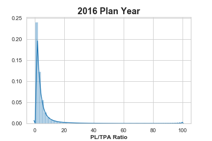
Looking at the full data set, the median % of Participant Loans to Total Plan Assets (PL/TPA) is equal to 2.10% but the average is a whopping 22.64%!  We should take this figure with a gain of salt since, as we will see, this data set has a long tail with some major outliers skewing our distribution.

Let’s first break it down by year.

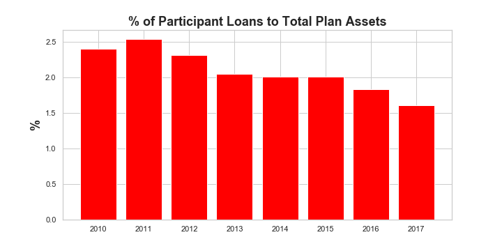
From the historical bar chart, we see that the median PL/TPA ratio has actually been declining from a high of 2.5% in 2011 to a low of 1.6% in 2017 (albeit these are partial year numbers for 2107, but should be reflective of the full year).

What can we glean from this?  Well there is certainly a trend here that could indicate that 401(k) plan participants are borrowing less against their retirement plans.  This would be good news and perhaps a reversion back to a what rates were prior to the Great Recession.  This could be an explanation for the higher rates in 2010 and 2011.  The other explanation may be less in the numerator of this ratio but rather the denominator.

Bull Market in Equities

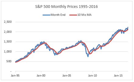
It’s curious that the start of our downward trend in the PL/TPA ratio corresponds closely to the start of the equity bull market in 2009.  Without further analysis, it’s hard to say which is the correct interpretation.  My guess is that it is a combination of the two.  It stands to reason that, as the economy improved, plan participants were able to repay the loans taken in the immediate aftermath of the Great Recession reducing outstanding loan amounts.  At the same time plan assets would have been boosted by higher equity returns.

A Long Tail Wagging the Dog?

The last point I want to make about this data is how skewed the distribution is.  As mentioned above, the difference between the median PL/TPA ratio to the average is huge.  In fact, there are plans that have 100% PL/TPA ratios.  How this happens will require more analysis and perhaps should be excluded altogether from the analysis.  But to give you an idea of what this looks like, here is the distribution for 2016, the most recent full year of data in our analysis.

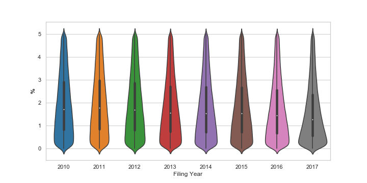
Now let’s look all the years in our analysis excluding the values in our tail by limiting the PL/TPA ratios to those between 0 and 5% which will capture the bulk of our plans.

We can see the downward trend in the median PL/TPA ratio represented by the white dot.  But it also appears that the distribution has gotten tighter around the median with 2017 showing the most pronounced tightening.  The black box illustrates the extent of the 25th and 75th percentiles.

So What’s the Right Number?

If you are inclined to believe that the ratio of 401(k) plan participant loans to total plan assets is an indicator of participant financial wellness, you would be best to focus your efforts on plans where this measure exceeds 2%.  But recognize that there are a lot of outliers and financial wellness may not have anything at all to do with this statistic.

Perhaps a look at individual states or looking at micro versus mega plans will yield additional insights.  Stay tuned.

Posted in: Blog
 | Tags: ,
Searching by Plan Type vs Searching by Carrier Benefits All
March 04, 2019

If you’re a user of our American Directory of Group Insurance tool, you might be familiar with the Plan Type search, which allows you to search by the plan type codes listed on the Form 5500 (and if you’re not a user of the American Directory of Group Insurance, sign up for a free trial here). While this search is useful for finding basic plan types like Health, Dental, Vision, and etc., there are a number of plan types that aren’t included in this search filter that you might be missing out on. That’s where Carrier Benefits All comes in. We’re going to explore this underused search filter to show you where the data comes from and what the differences are, so that you can use this in your own group insurance lead generation.

Where The Data Comes From

The data that we use for the Plan Types search comes from section 8b on the main Form 5500. This section gives an overview of the basic plan types covered by the entire plan.


Sample Section 8b of the 5500

The data we use for the Carrier Benefits All search filter comes from the Schedule A itself, section 8 in Part III to be exact. This section has a much more expansive list of benefit types, and shows exactly what each policy covers.


Sample Section 8 of the Schedule A

Since Section 8 on the Schedule A covers more types of coverage, Carrier Benefits All is the search filter you’ll want to use if you’re looking to do more prospecting within a specific niche.

Plan Coverages Searchable in Carrier Benefits All, but Not in Plan Type

Prescription Drug:

Prescription drug insurance covers some or all of the costs of prescriptions for the participants in the plan. If you work for one of the many carriers and brokers who specialize in prescription drug coverage, the Carrier Benefits All search filter is just what you’re looking for.

Stop-Loss:

Stop-Loss insurance provides protection against catastrophic or unpredictable losses, and is used by sponsors who self-fund their benefit plans but don’t want to take on all the liability for losses from the plan. If you work with self-funded plans, this type of search is available only through the Carrier Benefits All search filter.

HMO, PPO and POS plans:

If you specialize in working with specific plan network types, these searches are made for you. You can easily identify the plan networks by searching for companies that have HMO, PPO and/or POS contracts with a carrier.

Employee Assistance Program:

These programs were originally instituted to combat occupational alcoholism, but now work with employees to resolve many issues that affect productivity and satisfaction at work. Providers who operate in this space can go to this search to find all the companies who utilize EAPs and how much they’re being paid for the service.

Conclusion

This is just a small sample of the different plan types not covered by the basic Plan Type search in the 5500. If you’re looking for more niche areas of coverage, it might just be available in the Carrier Benefits All search option.

Posted in: Blog
 | Tags: , , , ,
Lifecycle of the Form 5500
February 11, 2019

“How old is this data?”

That’s the first question on everyone’s mind…and for good reason. We’re in an age of instant information and immediate updates in 280 characters or less. So brace yourself, Form 5500 data is old. To put into perspective what is normal, as of Q1 2019 the latest and most complete 5500 data is the 2017 filing year. The majority of the 2018 filing year disclosures will be filed to the Department of Labor starting July 2019 and likely finish by January 2020.

That long timeframe is the result of an unusual deadline system. At least, as an individual, it seems strange! While the Form 5500 looks like a tax document, there’s no April 15 for sponsors (i.e., employers or unions who file a 5500). Instead, deadlines are dependent on when your plan year ends. After that end date, there are seven months until you need to file. That’s the key reason why this data is aged.

For most plans, they run from January 1 through December 31 each year. That puts their first deadline on July 31 of the following year. These sponsors can also take an automatic extension of 10 weeks that pushes their deadline to October 15. Judy Diamond Associates (aka JDA) notes that most Form 5500s are filed around these dates. Just by how the system is designed, Form 5500 data is six months to nearly a year old by the time it’s released to the public. And that’s just the plans that run on a calendar year!

JDA tries to combat this in two important ways. Firstly, we’re continually working to provide you with the most recent contact names for sponsors with 100+ participants. Form 5500s don’t ask for those names, that’s something we add to help offset the age. Secondly, by limiting search results to the most recent filing within the past two filing years. For you 2019 users, if you’ve ever browsed through your results and noticed a couple of 2016s sprinkled among the 2017 filings, that’s likely because the sponsor has an uncommon plan year.

Best Practices Tip:

Want to stay on top of every update as it happens? Use the Advanced Search filter, “Plan Recently Updated.” Add this to your favorite filters, save the search, and run each month.

Need to limit your list to a specific filing year? You can change our default filter of the most recent filing, within the past two years, to any year. JDA data goes back to the 2007 year if time travel is your thing!

Posted in: Blog
 |