Red Flag: Bottom 10% in Employer Contributions – For Prospecting? (Yes, Really)
February 04, 2019


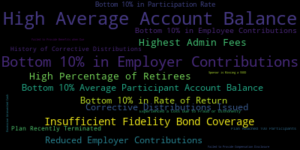
In my previous post, I introduced a data point pioneered by Judy Diamond called Red Flags.  These are the 19 proprietary flags identifying retirement plans with problems in plan design, administration or performance.  Red Flags are a hugely valuable tool.  This is especially so when searching the 5500 database to find prospects.  Advisers can use Red Flags to highlight their strengths and present their unique value proposition to sponsors.

Red Flag: Bottom 10% in Employer Contributions

In that first post on Red Flags, we explored High Average Account Balance.  It is the most widely occurring Red Flag among 401(k) plans.  In this post we will take a deeper look at the Red Flag labeled Bottom 10% in Employer Contributions.  It is the second most widely occurring Red Flag.  Together, these two Red Flags make up a little more than a third of plans having one or more Red Flags.  So, how can identifying plans in the Bottom 10% in Employer Contributions be useful for prospecting?

Sponsors offering a low or zero match for participants are generally smaller companies.  Searching the database of 401(k) plans reporting in the most recent filing year (2017), we find about 118,000 plans.  This is one of the reasons this particular Red Flag is so prevalent.  Median statistics for this group show that these are indeed small plans with the median number of participants equal to 5 and total plan assets of $216,588.

Generally speaking, smaller plans offer fewer benefits and not providing a participant match is an easy place to reduce costs.  Unless you specialize in the micro-market, this may not be the best place to focus your efforts.  But wait.  If we rank plans by plan assets, we see a different picture with many plans with hundreds of millions in plan assets.

Separating the Wheat from the Chaff

To get a better sense of what opportunities exist, let’s limit our list based on a measure of plan size.  One such measure is the number of participants.  When we do this and include only plans with 100 or more plan participants, we find 8,699 companies.  And low and behold, the median total plan assets increases to just over $3 million.  Now this is something we can work with as these larger firms will be more receptive to the benefits to be gained in employee recruitment, retention and participant outcomes.

Despite the vast number of smaller plans with the Red Flag Bottom 10% of Employer Contributions, this is still a valuable tool.  But unless your focus is micro-plans, it may be best to use this Red Flag in combination with other criteria.  One strategy is to include a measure of plan size such as total plan participants or total plan assets to find the best opportunities where sponsors may be more interested in increasing their match rate.

Posted in: Blog
 | Tags: ,
Plan Scorecard: How to Measure a Retirement Plan’s Heath
January 28, 2019

One of the most useful features unique to Retirement Plan Prospector is our Plan Scorecard. The Scorecard allows our users to get a brief overview of the plan’s performance and the areas where there might be room for improvement. The Plan Scorecard also enables you to compare the quality of a plan to another plan quickly and accurately. The overall plan score is created by ranking all the plans nationwide by seven different categories. Once the companies are rated on a percentile scale against each other in the seven different categories, we combine the seven different metrics together into one score with a proprietary weighted formula. We’ll go over the seven different categories and how to use the Plan Score to find and win new business.

The 5 Types of Plan Scores

One of the first things you’ll notice when looking at the Plan Scorecard in Retirement Plan Prospector is that there are five different scores: an Overall or National Plan Score, a State Plan Score, an Industry Plan Score, an Asset Plan Score, and a Participant Plan Score. You can use the different types of Plan Score to see how a plan really stacks up compared to other plans from companies who share the same industry, same participant totals or asset size; in short, their actual peers and the companies they compete with for new business and new talent on a day to day basis.

Rate of Return

The first category listed on the Plan Scorecard is Rate of Return. We calculate this figure by looking at the growth of assets year over year, taking into account any participant contributions or withdrawals throughout the year. While the health of the market overall largely dictates the rate of return, consistent underperformance might suggest that the current advisor is not looking over the investment lineup very closely and adjusting the lineup to provide the best options for the plan’s participants, which you can use as a talking point if you find a plan with a low rate of return score.

Participation Rate

Participation Rate is the second category listed, and it is one of the more important categories on the plan scorecard. The participation rate is calculated by taking the number of active participants divided by the total number of eligible employees. Low participation rate impacts plan performance by capping the total amount of assets invested in the plan at a lower total, which could lead to issues with highly compensated individuals being unable to contribute up to the IRS maximum allowed. That, in turn, could lead to the plan having to issue corrective distributions to the highly compensated employees who go over the limit. Low participation rate can be an indicator of the current advisor not being able to properly educate the employees at the company on the value and importance of saving for retirement.

Participant Loans

Next up is Participant Loans as a Percentage of Assets. Taking loans out of your 401(k) is highly discouraged because of the impact it has on the growth of the participant’s account. The participant loses out on all the potential earnings on the account while paying back the loan on their 401(k) account. A low score on this category can be an indicator that the plan’s participants are not properly educated on the drawbacks of taking out the loans from their 401(k)

Participant Contributions

The next two categories are closely related: Average Participant Contributions and Percent Change in Participant Contributions. Average participant contributions are calculated by dividing the total participant contributions for the year by the number of participants in the plan. This category can be tricky to glean useful information from. Professional offices with low numbers of employees like doctors, dentists and accountants will have higher average contributions than a Fortune 500 company with employees all across the socioeconomic strata. Try looking at the participant total plan score or the industry plan score to get a better idea of how the plan stacks up against its peers. The change in average participant contributions is calculated by looking at the difference in contributions from the year before and the year that the score is calculated. Negative percentages can indicate a number of things from decreasing employer matches to distrust in the current advisor causing the participants to look for alternative investment options.

Employer Contributions

The last two categories are similar to the last section we covered, but Average Employer Contributions and Percent Change in Employer Contributions examines contributions from the employer side of the plan. The average employer contributions are calculated by dividing the employer contributions by the number of participants. A low score in this category could indicate a less generous employer match. A good 401(k) plan is key to attracting and retaining talented employees, so improving a low employer contribution score is very important to both the employer and the employees.

Penalties

In addition to the categories mentioned, penalties have a sizable impact on the overall Plan Score. Some of these penalties include issuing or having a history of issuing corrective distributions, having insufficient fidelity bond coverage and more. Having these penalties show up on the Plan Scorecard indicates poor plan management, and gives you talking points to take into your meetings with prospective clients.


Posted in: Blog
 | Tags: , ,
Supplemental Attachments to the 5500
January 07, 2019

While the Form 5500 is an incredible treasure trove of useful and informative data, there’s a whole other level of information that sometimes gets overlooked when talking about the 5500. The schedule of assets and the supplemental attachments to the 5500 provide a ton of insight on the plan’s structure and administration. Unfortunately, the Schedule of Assets and supplemental attachments aren’t available for every 5500, as companies that file the 5500-SF are not required to disclose that information. We’re going to walk through a typical example of a Schedule of Assets and supplemental attachments to show you how you can use this information to your advantage.

Schedule of Assets:

While you will find the Schedule of Assets at the end of a filing, it’s actually a section on the Schedule H, the schedule that has financial information for the plan. The Schedule of Assets is a part of the Schedule H Line 4 compliance questions, which have many disclosures that a company might potentially need to fill out. The most common are for Line 4j, which is the Schedule of Reportable Transactions, which is required when a plan completes a transaction worth 5% or more of the plan year-end assets, and Line 4i, which is the Schedule of Assets Held at Plan Year. The Schedule of Assets is the most interesting for an investment advisor looking to learn more about a plan. You’ll get a full breakdown of all the investment vehicles the plan is invested in and the breakdown of assets invested in each separate fund. This allows you as an advisor to look at the fund lineup for a prospective client’s plan and plan your sales pitch accordingly while making you look confident and diligent in the process.

Supplemental Filings:

The supplemental filings are usually comprised of two different sections: the independent auditor’s report and the financial statements. Both can be very useful when looking for talking points when approaching new prospective clients.

Auditor’s Report:

Typically, the auditor’s report will come back with a favorable opinion or a determination that the auditor was not provided with enough information to make an opinion. That covers a majority of the audit reports, but it’s still worth skimming through to look for any language that implies errors or fraudulent activity. If there are any severe mistakes or fraudulent activity associated with the plan, the plan sponsor will be more keen on switching to a new provider.


Financial Statements and Notes to the Financial Statements:

The financial statements will contain a lot of the same information that the Schedule H has on assets and liabilities. The notes to the financial statement, however, are much more useful. There, you’ll have a document akin to a plan summary, where you can find out all the information on participation eligibility, employer match rates, investment strategy and more. Reading through that information will allow you to make recommendations on new plan strategy with the client and prepare a custom presentation tailored to the individual client.

Judy Diamond Associates has all of the attachments to the 5500 available in our Retirement Plan Prospector and American Directory of Group Insurance Plans. Once you’ve identified a plan you’re interested in prospecting through tools, you can get the extra data you need to go above and beyond and clinch the deal.

Posted in: Blog
 | Tags: ,
Red Flags – A Powerful Tool for Prospecting
December 24, 2018


In this post, we are going to focus on one of Judy Diamond’s proprietary data points – Red Flags and how to use them in prospecting.  Red Flags are an innovation pioneered by JDA based on 30 years of experience with the Form 5500.  The idea behind Red Flags is to identify retirement plans that have a noteworthy characteristic that is not entirely obvious.  While many of the Red Flags point to potential problems, whether it be with performance, plan design or administration, this is not always the case.

There are nineteen Red Flags identified as important relative to prospecting.  Over the coming months, we will focus on one or more of these flags to provide a more detailed explanation along with some tips on how to use them in your practice.  For a complete list of the 19 Red Flags, click here.

The first Red Flag we will consider is High Average Account Balance.

Most Frequently Occurring Red Flags

High Average Account Balance

High Average Account Balance is the most widely occurring Red Flag showing up in 401(k) plans.  This accounts for nearly 200,000 plans in the 2017 plan year.  This is not surprising considering the median number of participants (10) and the median participation rate (100%) for plans with this flag.  So what is going on here and is it good or bad when focusing on prospecting?

High Average Account Balance is an example of a Red Flag that can be considered a positive screen.   This Red Flag helps to find plans with few participants and participants with a higher than average 401(k) balance.  The average 401(k) balance is $106,000 according to USA Today.  Plans tagged with High Average Account Balance in the JDA Retirement Plan Prospector database have a median account balance of $182,778 – a staggering $77,000 more.

What Types of Plans Have this Red Flag?

What types of firms make up these plans?  Physicians, Lawyers, Dentists, Financial Advisers, and other professional services firms comprise the majority of these plans.  This includes wealthy professionals with small group practices or partnerships that are able to save the maximum in their retirement accounts.

Knowing how to find these types of plans can be helpful in two ways.  First, the business owners and participants are one and the same with these plans. As a result, it is much easier to get their attention regarding plan design or performance issues.  Therefore, whether it is high fees, poor fund selection or performance, you should be able to make a strong case to one of the business owners that it is in their best interest to meet with you.  Secondly, these companies and individual participants are not only valuable retirement prospects but can also be targeted for wealth management services.  As a result, since there are so many plans with this flag, it is relatively easy to find them in most geographic locations.

In future posts, we will take a look at some of the other most prevalent Red Flags.  These include Bottom 10% in Employer Contributions and Insufficient Fidelity Bond Coverage.

Posted in: Blog
 | Tags: , ,
One Form 5500, Two Industries
December 10, 2018

Retirement vs. Health & Welfare when Examining 5500 Data

This article is going to focus on how the disclosure differs for two distinct industries, retirement and welfare. Sponsors fill out a different Form 5500 for these plans and may even file a separate 5500 for multiple types of retirement or welfare plans. A great example is that a Sponsor might have a defined benefit plan and a defined contribution plan. That would result in two different filings with the Department of Labor.

Despite being utilized by both retirement and welfare plans, 5500 data has a lot in common between these two distinct groups. The sponsors who file are primarily private sector employers. That means that government agencies and employers are exempt, whether it’s at the city, county, state, or federal level. There’s a gray area when it comes to non-profits. Those organizations typically file a Form 990 about their expenses and funding, but not a Form 5500. They can elect to file if they feel it is advantageous for them to do so. It’s always worth a shot to search for them!

Many Schedules are filled out by both retirement and welfare plans. The publicly disclosed Schedules are A, MB, SB, C, D, G, H, I, and R. Not every plan files each Schedule though. It depends on the services utilized by the plan, its funding, and how it’s structured. Below we discuss some of the significant differences between the two plans. Most of us are solidly working within one industry, such as retirement, so you can jump to the section that applies to you.

Retirement Plans

You may have noticed while researching prospects that a behemoth like Acme Explosives disclosed their schedule of assets, an auditor’s report, their annuity carrier and vendors like their record keeper, yet Mom & Pop Shop USA has none of that. Absolutely maddening!

What you’re seeing is the Form 5500-SF, an abbreviated version of the Form 5500. In 2009 the DOL created a short form version of the 5500 to reduce the burden on companies with under 100 participants. With the exception of the Schedule SB, filed by smaller defined benefit plans, sponsors are not required to fill out schedules.

The Schedule A

If a plan has an insurance contract, they need to complete this Schedule. It’s where a carrier and their brokers are disclosed. When disclosing annuity contracts, they fill out Part II for the value of their investments.

The Schedule C

Retirement plans often use this Schedule to list their record keepers, brokers, investment managers, accounts, and so on. Section 2 is where service codes describe what they’ve been compensated for and we can see how much they received. Retirement plans are also more likely to make use of Sections 1 and 3, where we can see if a provider was eligible for indirect compensation and the formula for it.

The Schedule H

Only plans with over 100 participants file this Schedule. It has the same financial disclosure questions as the Form 5500-SF yet many more. You’ve probably heard that these filings also have a Schedule of Assets. As of 2018, the DOL doesn’t have a standard document for this supplementary Schedule. Instead, Sponsors submit attachments which are viewed as PDFs. These are always available in the Retirement Plan Prospector tool once you are looking at the Plan Details pages.

Health & Welfare Plans

Health and welfare plans can cover a wide variety of benefits. As long as they’re ERISA-qualified, it’s likely you can find it. Unlike with retirement plans, the minimum to file is 100 participants. Note, it’s not employees, but the number of individuals in a plan. If a sponsor has under 100 participants in their plan, then they’re exempt from filing a Form 5500.

The Schedule A

Like many of the Schedules, this one can be filled out by both retirement and health and welfare plans. On welfare returns, the Schedule A is often the star. Plans with insurance policies file this schedule and report the carrier, lives covered, premiums, benefits insured, and, if applicable, the brokers who sold the policy.

The Schedule C

When a welfare plan has organizations or individuals who are not insuring benefits, yet providing services to the plan, they’re disclosed here. The most commonly filled out Section is 2, where we see provider service codes and compensation values. Typically this includes third-party administrators, consultants, ASOs, and accountants. Users who work with self-funded plans make more use of this Schedule because it provides clues as to how the plan is managing their benefits.

The Schedule H

Unlike retirement plans, this isn’t as commonly filed. Roughly 10% of the plans in American Directory of Group Insurance have this Schedule. The general rule of thumb, when a plan is unfunded, they’ll file a Schedule H.


Posted in: Blog
 | Tags: , , ,
The History of the Employee Retirement Income Savings Act (ERISA)
December 03, 2018

The Early Days of Pension Plans

Private pension plans had been around in various forms since the early 1890s, but first real regulation of pension plans came with the Revenue Acts of 1921, 1926, and 1928, which included three major provisions that helped define retirement plans as we know them today. These acts allowed corporations to deduct contributions made to pension plans from their reported income, and allowed pension funds to accumulate income tax-free, and deferred taxes on the participants until the pension was distributed. These benefits were accompanied by discrimination testing and financial audit requirements.

One of catalysts that led to the enactment of ERISA was the closure of the Studebaker-Packard Corporation car manufacturing plant in South Bend, IN in 1963. The pension had promised generous benefits for the participants, but the plan was severely underfunded and wasn’t able to cover the benefits for many of the employees vested in the plan. The failure of the Studebaker pension plan, along with a high profile conviction of infamous Teamsters boss James Hoffa on pension fraud, drew a lot of attention to pension plan corruption and mismanagement and spurred talk of reform and regulation in Washington, DC.

The Introduction of ERISA

It took ten years for ERISA to come to fruition after the Studebaker pension failure. Senator Vance Hartke of Indiana (not coincidentally the state where the Studebaker plant was located) was the first to propose new legislation in 1965 that would provide for pension insurance and create the Pension Benefit Guaranty Corporation (PBGC) to collect the premiums from insured pension plans. The PBGC would pay out if a pension plan were to close and not have the funding to cover the amount owed to participants in the plan. Senator Jacob Javits was the architect of the main ERISA law, as he sponsored a number of different laws in the late 1960s that would later become key components of the final version of ERISA, with regulations touching on participation, vesting, funding, reporting, and disclosure rules for private pension plans.

Companies and labor unions both fought the passage of new regulations for pension plans, uneager to take on the challenge of more closely monitoring their pension offerings. Faced with the prospect of states enacting different sets of pension regulations that would have proved difficult for many companies who operated in multiple states to navigate, businesses warmed to the idea of national pension regulations. ERISA was passed by both houses of Congress by March 1974 and was ultimately signed into law in September 1974 by Gerald Ford.

“Who’s Who” and “What’s What”

The act gave regulating power to three agencies: the IRS, the PBGC and what is now known as the Employee Benefit Security Administration, or EBSA. As of the 2016 filing year, ERISA covers over 700,000 retirement plans and over 50 million active plan participants.

The Form 5500 was created by these three agencies to collect the disclosure information required by ERISA, and is the source of the vast majority of the data you’ll get from Judy Diamond Associates’ prospecting tools.

Posted in: Blog
 | Tags: , ,
Introducing the JDA Blog!
December 03, 2018

It is my pleasure to announce the launch of the Judy Diamond Associates official blog site. While we have always included resources and research about employee benefits in general and the Department of Labor Form 5500 in specific, we are now doubling our efforts to provide our clients and the community as a whole informative and insightful commentary related to all things 5500.

By the way, if you have not already downloaded our free 2018 401(k) Benchmark Report, please check it out by following this link.

Our goal here is to provide information that can help you gain an edge on your competition by educating you about the intricacies of the data that is available from the Form 5500. This includes not only how it can be used for prospecting but also for market sizing and protecting your business from poachers trying to steal your clients.

Some of the topics you can expect to see in future posts include:

  • CPAs, the 5500 and the 80 – 120 Rule
  • Limitations in the data available in the 5500 and how to get around them
  • How to use Red Flags, the Plan Score and Talking Points to highlight your competitive advantage
  • How bench-marking can be used during investment reviews
  • And, an answer to one of the most frequently asked questions, “Who is Judy Diamond? Is there a real person behind the name?”

Those are just a few of the ideas we have in mind. If you have any questions or ideas you think would be a good topic for us to address, please contact me at the email below.

Posted in: Blog
 | Tags: