Back Office Support in the Retirement Space: Research
November 25, 2019

What about Research?

My last post I looked into how he tools a Judy Diamond Associates is able to help with your back office support. Specifically, we looked at how Retirement Plan Prospector is able to help with the marketing side of your work. From prewritten dynamic marketing letters to adaptive graphics and presentation-ready plan reports, RPP is able to up your marketing game.

But we all know that preparing for a sale is more than just squaring away your marketing and graphics. You need to know all you can about your lead. Not only that, you need to know how your lead compares to the client you prefer to work with. Moreso, which of the nearly 800,000 plans that are filed every year provide the best ROI of your valuable time?

Advisor Scorecard

Analysis is not just something that looks outward. It also can be turned inward on your own book of business. The Advisor Scorecard helps you to determine and track the plans you currently have under management

After adding their plans in your book of business into your My Plans files, Prospector focuses its 
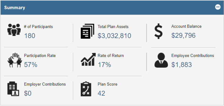
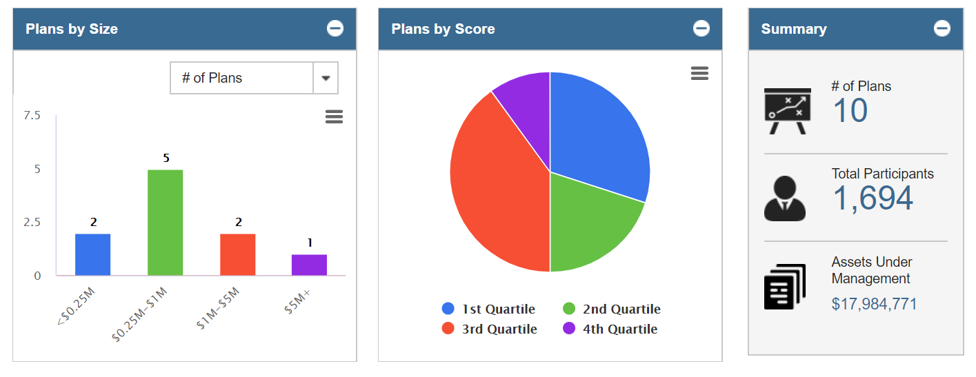
analytic tools to help. At the high-level view, you can maintain the general summary of your book of business (Number of Plans, Total Participants, and Assets Under Management). Additionally, you can see the breakdown of the plans under your management by Plan Size and Plan Score.

Plan scores look at the relative strength of a plan. By collecting the plan scores of all the plans in your book of business, you can come up with an average plan score for your clients. Comparing a lead’s low plan score to your “book of business score” is a great use of plan scores. Such a comparison is a data-driven reason for the sponsor to consider having you perform the same great work you did for your other clients.


Posted in: Blog
 | Tags: , ,
Back-to-school: 403(b) Plans
September 16, 2019

At the time of this writing, it is mid-September. The air is beginning to chill, the leaves are starting to turn, but most importantly your kids are now back in school. This makes it the ideal time to talk about 403(b) plans, the savings vehicle most commonly used by teachers (and others in the not-for-profit space) to save for retirement.

If you understand 401(k) plans, you mostly understand 403(b) plans as well. 403(b)s are Defined Contribution plans where the participant’s money is tucked away for tax-deferred growth. Traditional Defined Benefit pension plans for teachers are critically underfunded, and many states have been forced to cut benefits for future retirees. Depending on a DB as a primary source of retirement income can have devastating consequences (just ask the auto workers), which brings us back to 403(b) plans.

According to the Bureau of Labor Statistics, there are approximately 20 million eligible 403(b) participants (both educators and non-profit employees) across the country, which suggests that there are probably about 200,000 403(b) plans. We don’t know what the actual number is, because of one of the most significant differences between 403(b) plans and their 401(k) cousins: ERISA status.

ERISA, the Employee Retirement Income Security Act, provides participants and plan sponsors with certain basic protections and safeguards. The problem is that not all 403(b) plans are ERISA-qualified. In fact, most of them are not. Let’s examine what makes a 403(b) plan ERISA qualified and what that means.

The “default” setting on a 403(b) plan tends to be that it is not ERISA qualified. To qualify for an exemption from ERISA, a 403(b) has to meet certain criteria. There are a lot of them, but it mostly boils down to 3 things:


  1. Participation in the plan is completely voluntary
  2. The only form of plan contribution allowed is the employee deferrals. In other words… NO EMPLOYER MATCH.
  3. The employer doesn’t become too involved in plan administration


The first item on this list is pretty self-explanatory; you can’t force people into the plan or mandate participation. Items 2 and 3 are actually variations on the same theme, though I broke them out here as separate items because I’ve seen #2 trip up a lot of employers. Essentially, in order to maintain an ERISA-exempt 403(b) plan the sponsor has to stay as far away from the plan as possible. The role of the sponsor in this situation is to set up the plan, hire a good TPA to manage said plan, and run for the hills. The more involvement a sponsor has in the 403(b), the more likely it will be that the 403(b) loses its ERISA exemption.

Running an ERISA-qualified 403(b) plan is not a bad thing, necessarily. The upside is that ERISA-qualified plans are generally exempt from state laws because they’re governed by federal ones. This, of course, is super useful if you are a non-profit with employees in multiple states. Sponsors of ERISA-qualified plans can be as involved as they want, making decisions on plan design, dropping in employer matches, and generally ensuring the plan stays in compliance. Both sponsors and participants are also protected by the weight of ERISA. For Sponsors, this means that they are protected from liability for losses arising from the investment decisions of the participants (as long as they meet ERISA 404(c) requirements). For participants, it ensures transparency into fees and other aspects of plan administration, courtesy of the Form 5500 ERISA disclosure document. The downside for a plan sponsor is that now they’ve actually got to file a 5500 and comply with all aspects of ERISA.

Speaking of 5500s, just how many 403(b) plans out there are actually filing? Here’s a look at the number of ERISA-qualified 403(b) plans over the last six years.

You can see from the chart that the number of ERISA-qualified 403(b) plans is declining (though in the interest of full disclosure, the 2018 number is an estimate based on the ~40% of 2018 filings currently available). By my estimate, this means that of all the 403(b) plans out there only about 10% are ERISA-qualified.

There are a number of possible, even probable reasons for this decline. In 2012, the Department of Labor clarified its position on whether or not an employer match is enough to subject a plan to ERISA (yes, it is). This caused some sponsors to unexpectedly find themselves with an ERISA plan they didn’t want, and some have been remodeling their plans to regain an ERISA exemption. Additionally, the introduction of the fiduciary rule has given rise to more TPAs who offer a full, turnkey solution, which is exactly what a 403(b) sponsor needs if they want to be exempt.

So as you are attending “meet the teacher” and “back to school” sessions, make sure you ask your children’s educators about their 403(b) plan. Unless, of course, you work for the school district, in which case you may be inadvertently waiving your ERISA exemption.

Posted in: Blog
 | Tags: , , ,
How to make Benchmarking and Peer Groups Work for You
April 29, 2019

Last April, Judy Diamond Associates released Retirement Plan Prospector+, a brand new upgrade to Retirement Plan Prospector that features an extensive collection of tools to boost retirement plan prospecting, from back office marketing support to advanced data analytics. One of the features introduced in the Retirement Plan Prospector+ update is the ability to benchmark retirement plans on a level of granularity that hadn’t been possible before.

The Plan Scorecard is a form of retirement plan benchmarking, but the default views available through the Plan Scorecard aren’t always the most useful when looking at how a plan stacks up compared to its peers. For example, looking at the Plan Score by industry won’t always give you a good benchmark when you want to compare a small five-person CPA firm when the pool of plans you’re benchmarking by industry against including huge, multinational accounting firms with thousands of employees.

Our Benchmarking tool is the solution to getting the best benchmark possible for every kind of plan by allowing you to build your own set of criteria to benchmark against. We even provide an algorithmically defined peer group for many of the plans in the database, so you don’t have to make your own. It’s easy as saving a search using the criteria you want to benchmark against and pulling up the Benchmarking tool when you’re on the Plan Details page of the plan you want to benchmark. If you don’t have access to the Benchmarking tool in your version of Prospector, you can call (800) 231-0669, option 1 to speak with a sales representative to learn about upgrading to Retirement Plan Prospector+.

The applications of the Benchmarking feature are endless. You can define your peer group for a potential prospect to see how the plan currently stacks up against its peers, and you can use any weaknesses or shortcomings you find to build your talking points when you have your meeting with the prospect. You can even create a saved search for your own plans to use as a benchmark to either monitor their performance against the competition or use as a selling point to potential prospects by noting the strength of your plans’ average performance against their current plan performance.

The Benchmarking tool is just one of the many great features included in Retirement Plan Prospector+, and learning to use it effectively will be a massive boost to your prospecting efforts. If you need help with using any part of Prospector+, we have weekly training sessions available with our experts that you can sign up for, and you can call our support line at (800) 231-0669 from 9 am to 5 pm EST.

Posted in: Blog
 | Tags: , ,
A Deep Dive into 401(k) Participant Loan Data
March 11, 2019

Last month I attended a conference where I had a couple of interesting conversations on the topic of participant loans.  Financial wellness was a big theme at the conference.  The advisers I spoke with were all trying to use participant loans as a window into the financial health of 401(k) plan participants.  More specifically, they were interested in the ratio of outstanding participant loans to total plan assets.  The idea being, the higher the ratio, the more likely participants are in need of a financial wellness program.

Thinking about this on my way home, I wondered what even constitutes a high participant loan to total assets ratio?  And how much variation is there in this ratio?  One of the great benefits of working at Judy Diamond is having access to the historical 5500 data in its raw form.  The data can then be imported into tools like Tableau or Panda Dataframes to do more detailed analysis.  So once back home, I got to work exploring this aspect of the data.

The Data

To begin the analysis, I gathered all the 401(k) plans available from our raw data feed where both End of Year Total Assets and End of Year Participant Loans were greater than zero.  This yielded about 1.7 million records over 8 years from 2010 to 2017.  Each year contains approximately 220,000 records with 2017 a partial year containing 129,000 records.

Looking at the full data set, the median % of Participant Loans to Total Plan Assets (PL/TPA) is equal to 2.10% but the average is a whopping 22.64%!  We should take this figure with a gain of salt since, as we will see, this data set has a long tail with some major outliers skewing our distribution.

Let’s first break it down by year.

From the historical bar chart, we see that the median PL/TPA ratio has actually been declining from a high of 2.5% in 2011 to a low of 1.6% in 2017 (albeit these are partial year numbers for 2107, but should be reflective of the full year).

What can we glean from this?  Well there is certainly a trend here that could indicate that 401(k) plan participants are borrowing less against their retirement plans.  This would be good news and perhaps a reversion back to a what rates were prior to the Great Recession.  This could be an explanation for the higher rates in 2010 and 2011.  The other explanation may be less in the numerator of this ratio but rather the denominator.

Bull Market in Equities

It’s curious that the start of our downward trend in the PL/TPA ratio corresponds closely to the start of the equity bull market in 2009.  Without further analysis, it’s hard to say which is the correct interpretation.  My guess is that it is a combination of the two.  It stands to reason that, as the economy improved, plan participants were able to repay the loans taken in the immediate aftermath of the Great Recession reducing outstanding loan amounts.  At the same time plan assets would have been boosted by higher equity returns.

A Long Tail Wagging the Dog?

The last point I want to make about this data is how skewed the distribution is.  As mentioned above, the difference between the median PL/TPA ratio to the average is huge.  In fact, there are plans that have 100% PL/TPA ratios.  How this happens will require more analysis and perhaps should be excluded altogether from the analysis.  But to give you an idea of what this looks like, here is the distribution for 2016, the most recent full year of data in our analysis.

Now let’s look all the years in our analysis excluding the values in our tail by limiting the PL/TPA ratios to those between 0 and 5% which will capture the bulk of our plans.

We can see the downward trend in the median PL/TPA ratio represented by the white dot.  But it also appears that the distribution has gotten tighter around the median with 2017 showing the most pronounced tightening.  The black box illustrates the extent of the 25th and 75th percentiles.

So What’s the Right Number?

If you are inclined to believe that the ratio of 401(k) plan participant loans to total plan assets is an indicator of participant financial wellness, you would be best to focus your efforts on plans where this measure exceeds 2%.  But recognize that there are a lot of outliers and financial wellness may not have anything at all to do with this statistic.

Perhaps a look at individual states or looking at micro versus mega plans will yield additional insights.  Stay tuned.

Posted in: Blog
 | Tags: ,
Prospecting the Federal Form 5500 – The Offensive Approach
February 18, 2019

Using 5500 Data for Offensive and Defense Business Development (Part 3): The Offensive Approach

The most common, and effective, way to use Retirement Plan Prospector is offensively. The size of the data pool contained in the data set not only provides brokers with a massive lead list but also provides details required to make a data-driven business development plan work.

IDENTIFY THE BEST TARGETS

While looking for red flags and plan scores are a great way to begin identifying the leads with the highest chance of conversion, that is just the beginning. If you know of a competitor’s offering that you outperform, locating the plans they manage is a great way to focus your efforts.

THE UNSATISFIED/VERY SATISFIED CLIENTS

Retirement Plan Prospector has data on plans stretching back nearly 10 years. This history can show sponsors who frequently change their financial advisors. Noticing that a sponsor changes their FA every couple of years might indicate that they are likely to reevaluate their current plans. However, such a sponsor might be hard to retain. On the other hand, you could identify sponsors who tend to pick and advisor and stick with them. These leads might be more difficult to win but are likely to stick with you once you have won their business.

THE BOOK OF BUSINESS COMPARISON

Plan scores look at the relative strength of a plan. By collecting the plan scores of all the plans in your book of business, you can come up with an average plan score for your clients. Comparing a lead’s low plan score to your “book of business score” is a great use of plan scores. Such a comparison is a data-driven reason for the sponsor to consider having you perform the same great work you did for your other clients.

THE JDA ADVANTAGE: With our monthly updates, you will always have the most recent data available. Quickly knowing that a plan is in trouble, and who to reach out to will give you a better chance of locating a floundering plan before its advisor is aware something is wrong.

Posted in: Blog
 | Tags: , , ,
Red Flag: Bottom 10% in Employer Contributions – For Prospecting? (Yes, Really)
February 04, 2019


In my previous post, I introduced a data point pioneered by Judy Diamond called Red Flags.  These are the 19 proprietary flags identifying retirement plans with problems in plan design, administration or performance.  Red Flags are a hugely valuable tool.  This is especially so when searching the 5500 database to find prospects.  Advisers can use Red Flags to highlight their strengths and present their unique value proposition to sponsors.

Red Flag: Bottom 10% in Employer Contributions

In that first post on Red Flags, we explored High Average Account Balance.  It is the most widely occurring Red Flag among 401(k) plans.  In this post we will take a deeper look at the Red Flag labeled Bottom 10% in Employer Contributions.  It is the second most widely occurring Red Flag.  Together, these two Red Flags make up a little more than a third of plans having one or more Red Flags.  So, how can identifying plans in the Bottom 10% in Employer Contributions be useful for prospecting?

Sponsors offering a low or zero match for participants are generally smaller companies.  Searching the database of 401(k) plans reporting in the most recent filing year (2017), we find about 118,000 plans.  This is one of the reasons this particular Red Flag is so prevalent.  Median statistics for this group show that these are indeed small plans with the median number of participants equal to 5 and total plan assets of $216,588.

Generally speaking, smaller plans offer fewer benefits and not providing a participant match is an easy place to reduce costs.  Unless you specialize in the micro-market, this may not be the best place to focus your efforts.  But wait.  If we rank plans by plan assets, we see a different picture with many plans with hundreds of millions in plan assets.

Separating the Wheat from the Chaff

To get a better sense of what opportunities exist, let’s limit our list based on a measure of plan size.  One such measure is the number of participants.  When we do this and include only plans with 100 or more plan participants, we find 8,699 companies.  And low and behold, the median total plan assets increases to just over $3 million.  Now this is something we can work with as these larger firms will be more receptive to the benefits to be gained in employee recruitment, retention and participant outcomes.

Despite the vast number of smaller plans with the Red Flag Bottom 10% of Employer Contributions, this is still a valuable tool.  But unless your focus is micro-plans, it may be best to use this Red Flag in combination with other criteria.  One strategy is to include a measure of plan size such as total plan participants or total plan assets to find the best opportunities where sponsors may be more interested in increasing their match rate.

Posted in: Blog
 | Tags: ,
Plan Scorecard: How to Measure a Retirement Plan’s Heath
January 28, 2019

One of the most useful features unique to Retirement Plan Prospector is our Plan Scorecard. The Scorecard allows our users to get a brief overview of the plan’s performance and the areas where there might be room for improvement. The Plan Scorecard also enables you to compare the quality of a plan to another plan quickly and accurately. The overall plan score is created by ranking all the plans nationwide by seven different categories. Once the companies are rated on a percentile scale against each other in the seven different categories, we combine the seven different metrics together into one score with a proprietary weighted formula. We’ll go over the seven different categories and how to use the Plan Score to find and win new business.

The 5 Types of Plan Scores

One of the first things you’ll notice when looking at the Plan Scorecard in Retirement Plan Prospector is that there are five different scores: an Overall or National Plan Score, a State Plan Score, an Industry Plan Score, an Asset Plan Score, and a Participant Plan Score. You can use the different types of Plan Score to see how a plan really stacks up compared to other plans from companies who share the same industry, same participant totals or asset size; in short, their actual peers and the companies they compete with for new business and new talent on a day to day basis.

Rate of Return

The first category listed on the Plan Scorecard is Rate of Return. We calculate this figure by looking at the growth of assets year over year, taking into account any participant contributions or withdrawals throughout the year. While the health of the market overall largely dictates the rate of return, consistent underperformance might suggest that the current advisor is not looking over the investment lineup very closely and adjusting the lineup to provide the best options for the plan’s participants, which you can use as a talking point if you find a plan with a low rate of return score.

Participation Rate

Participation Rate is the second category listed, and it is one of the more important categories on the plan scorecard. The participation rate is calculated by taking the number of active participants divided by the total number of eligible employees. Low participation rate impacts plan performance by capping the total amount of assets invested in the plan at a lower total, which could lead to issues with highly compensated individuals being unable to contribute up to the IRS maximum allowed. That, in turn, could lead to the plan having to issue corrective distributions to the highly compensated employees who go over the limit. Low participation rate can be an indicator of the current advisor not being able to properly educate the employees at the company on the value and importance of saving for retirement.

Participant Loans

Next up is Participant Loans as a Percentage of Assets. Taking loans out of your 401(k) is highly discouraged because of the impact it has on the growth of the participant’s account. The participant loses out on all the potential earnings on the account while paying back the loan on their 401(k) account. A low score on this category can be an indicator that the plan’s participants are not properly educated on the drawbacks of taking out the loans from their 401(k)

Participant Contributions

The next two categories are closely related: Average Participant Contributions and Percent Change in Participant Contributions. Average participant contributions are calculated by dividing the total participant contributions for the year by the number of participants in the plan. This category can be tricky to glean useful information from. Professional offices with low numbers of employees like doctors, dentists and accountants will have higher average contributions than a Fortune 500 company with employees all across the socioeconomic strata. Try looking at the participant total plan score or the industry plan score to get a better idea of how the plan stacks up against its peers. The change in average participant contributions is calculated by looking at the difference in contributions from the year before and the year that the score is calculated. Negative percentages can indicate a number of things from decreasing employer matches to distrust in the current advisor causing the participants to look for alternative investment options.

Employer Contributions

The last two categories are similar to the last section we covered, but Average Employer Contributions and Percent Change in Employer Contributions examines contributions from the employer side of the plan. The average employer contributions are calculated by dividing the employer contributions by the number of participants. A low score in this category could indicate a less generous employer match. A good 401(k) plan is key to attracting and retaining talented employees, so improving a low employer contribution score is very important to both the employer and the employees.

Penalties

In addition to the categories mentioned, penalties have a sizable impact on the overall Plan Score. Some of these penalties include issuing or having a history of issuing corrective distributions, having insufficient fidelity bond coverage and more. Having these penalties show up on the Plan Scorecard indicates poor plan management, and gives you talking points to take into your meetings with prospective clients.


Posted in: Blog
 | Tags: , ,
10 Terms You Need to Know (to Understand the 5500)
January 21, 2019

If you are new to the market and the 5500, there are likely to be a ton of terms that you may be unfamiliar. Before you dig too deep into your 5500 research, review the below ten terms. Whether you are in the retirement or group insurance market, studying the below terms will help you prepare for prospecting.

1. ERISA

The Employee Retirement Income Security Act of 1974. This law sets minimum standards for most voluntary health and retirement plans offered in the private sector. Yearly completion of the Form 5500 is one part of this law.

2. Sponsor

A Sponsor is a company that provides a retirement plan to their employees

3. Provider

A provider is a company or agent who services a retirement plan for the sponsor. These services can be anything from investment management, to recordkeeping, to third-party administration. You can view the providers for a plan on the Schedule C of the 5500, where you’ll find information on the company, services provided, and the compensation they’re required to disclose.

4. Participant

An employee of a plan who is part of a plan. They may be active or retired.

5. Plan Number

Each ERISA qualified plan is assigned a three-digit plan number. Together with an Employer Identification Number (EIN) and Plan Year, a specific plan may be identified. Plan numbers from 001 to 500 are Retirement plans. Plan numbers from 501 and 999 are Health and Welfare plans. A Plan number provides no other additional data.

6. Plan Year

This is the year of which the plan covers. For instance is a plan’s term runs from January 1, 2017, to December 31, 2017, the Plan Year is 2017. Much like an individual’s income tax filings, these forms are submitted yearly for the previous year. As a sponsor has 201 days to file a 5500, and they may apply for a two-month extension, a 5500 may be made available to the public up to 10 months after the plan renews.

7. Plan Type

Plan types on the 5500 are indicated by a code consisting of a number and a letter and denote the features of a plan. This could cover anything from whether a plan is a defined benefit or defined contribution plan, whether a plan is a 401(k) plan, 403(b) plan, etc., and other features of the plan like having automatic enrollment and allowing participant directed accounts. It is not uncommon for retirement plans to have several of these plan type codes listed, and understanding them is key to understanding the structure of a retirement plan.

8. Defined Benefit

A defined benefit plan are employer-sponsored retirement plans where the retirement Benefits owed are calculated using a variety of factors such as length of employment and compensation history. They more commonly referred to as pension plans. The company invests in a pension fund and pays the retirees their benefits out of that fund. Defined benefit plans used to be the more popular type of retirement plan, but 401(k)s and other defined contribution plans have swiftly become the preferred choice for retirement plan sponsors.

9. Defined Contribution

A defined contribution plan is a retirement plan paid for in contributions directly from the employee’s pay, instead of the employer. These contributions are typically tax-deferred and employers generally choose to match varying percentages of employee contributions. While the benefit from a pension plan is precalculated, and the employer is on the hook for that amount no matter what, defined contribution plan benefits ultimately depend on the level of employee contributions and the rate of return on the investments made by the plan.

10. Corrective Distribution

Every year a plan’s participant may contribute up to $18,500 into their 401(k) plan. Contributions above this amount are not allowed by the IRS. When a participant, often a Highly Compensated Employee (HCE) contributes over this amount, this overage must be corrected.


THE JUDY DIAMOND ADVANTAGE

Now that you are more familiar with these foundational terms, put them to use looking at some 5500s. You can find 5500s either of Judy Diamond Associate’s sites, FreeERISA and Retirement Plan Prospector.

Posted in: Blog
 | Tags: , ,
Prospecting the Federal Form 5500 – Finding Your Target
January 14, 2019

Using 5500 Data for Offensive and Defense Business Development (Part 2): Finding Your Target

Now that the east coast is covered in snow, it’s the perfect time to continue my series on Prospecting the Federal Form 5500, this time focusing on how to find the targets you identified in the first post of this series.

With hundreds of thousands of plans out there, it can be hard to find those plans that are right for you to reach out to. Instead of spending time, effort, and even money contacting leads with little chance of conversation, you need to focus your attention on leads that would be more receptive to your approach.

WHAT ARE RED FLAGS?

Red flags are a series of indicators the experts at Judy Diamond Associates identified to aid in locating “in trouble” plans. These red flags not only identify a potential issue in a plan, they also act as tags which can be searched for. Which 19 separate Red Flags to choose from, it is easy to tailor one’s research. Included in our red flags are:

  • High Average Account Balance
  • Corrective Distribution Issued
  • Insufficient Fidelity Bond Coverage
  • Highest Admin Fees

For more on our red flags, check out Michael Iapalucci’s outstanding new series focusing on our Judy Diamond Associate’s red flags.

PLAN SCORES

Knowing how a plan stacks up against other plans in a state or industry can be critical in identifying trends in your market. Therefore, having access to tools that quickly aid in plan comparison is a must! Plan scores provide you with seven metrics by which a plan can be compared to other plans. Additionally, JDA includes an overall umbrella score for a more high-level analysis. These scores help you understand the landscape around the plan so that you are better able to develop your pitch, or guide your business development efforts.

ADVANCED SEARCH

Now that you know what your current clients look like, you can use the advanced search feature to find other companies that match! This may seem a challenge since there are over 450 fields of data in a 5500 form. There are many options including Participant or Asset Total, to specific Red Flags, to Broker or Vendor Names. However, the advanced search box allows you to quickly narrow the field of leads from hundreds of thousands to a more manageable number of perfect leads.

PERFORMANCE BENCHMARKING

Knowing how a plan performs against other plans very helpful. It is a good idea to research a plan to determine if they really are a good lead for you. Performance-based benchmarking is a great way to accomplish this. Identifying a plan that historically underperforms plans in your region or your own book of business helps you focus your attention.


THE JDA ADVANTAGE:

These are just a few of the tools within Retirement Plan Prospector Prospector Plus tool designed to bring the experience of the JDA Team to your office. These tools are easy to learn, quick to use, and, most importantly, they provide results. There is a reason our clients stay with us year after year.

Posted in: Blog
 | Tags: , , ,
Red Flags – A Powerful Tool for Prospecting
December 24, 2018


In this post, we are going to focus on one of Judy Diamond’s proprietary data points – Red Flags and how to use them in prospecting.  Red Flags are an innovation pioneered by JDA based on 30 years of experience with the Form 5500.  The idea behind Red Flags is to identify retirement plans that have a noteworthy characteristic that is not entirely obvious.  While many of the Red Flags point to potential problems, whether it be with performance, plan design or administration, this is not always the case.

There are nineteen Red Flags identified as important relative to prospecting.  Over the coming months, we will focus on one or more of these flags to provide a more detailed explanation along with some tips on how to use them in your practice.  For a complete list of the 19 Red Flags, click here.

The first Red Flag we will consider is High Average Account Balance.

Most Frequently Occurring Red Flags

High Average Account Balance

High Average Account Balance is the most widely occurring Red Flag showing up in 401(k) plans.  This accounts for nearly 200,000 plans in the 2017 plan year.  This is not surprising considering the median number of participants (10) and the median participation rate (100%) for plans with this flag.  So what is going on here and is it good or bad when focusing on prospecting?

High Average Account Balance is an example of a Red Flag that can be considered a positive screen.   This Red Flag helps to find plans with few participants and participants with a higher than average 401(k) balance.  The average 401(k) balance is $106,000 according to USA Today.  Plans tagged with High Average Account Balance in the JDA Retirement Plan Prospector database have a median account balance of $182,778 – a staggering $77,000 more.

What Types of Plans Have this Red Flag?

What types of firms make up these plans?  Physicians, Lawyers, Dentists, Financial Advisers, and other professional services firms comprise the majority of these plans.  This includes wealthy professionals with small group practices or partnerships that are able to save the maximum in their retirement accounts.

Knowing how to find these types of plans can be helpful in two ways.  First, the business owners and participants are one and the same with these plans. As a result, it is much easier to get their attention regarding plan design or performance issues.  Therefore, whether it is high fees, poor fund selection or performance, you should be able to make a strong case to one of the business owners that it is in their best interest to meet with you.  Secondly, these companies and individual participants are not only valuable retirement prospects but can also be targeted for wealth management services.  As a result, since there are so many plans with this flag, it is relatively easy to find them in most geographic locations.

In future posts, we will take a look at some of the other most prevalent Red Flags.  These include Bottom 10% in Employer Contributions and Insufficient Fidelity Bond Coverage.

Posted in: Blog
 | Tags: , ,